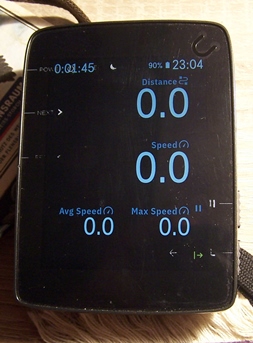
Screen view
Answered
-

Hi Tom,
I am sorry to hear that the display is problematic for you! We did recently change the font and text sizes to make the data fields a little easier to read. (last update) I hope that helped some.
Others have asked about more customization for things like font and text size/color. I can see where that would be useful to our community members. I am not personally sure of the complexity of that request, but I will surely share that feedback with the Product Team. Thank you for letting us know!
-

It should not be much of a problem for the Product Team to make this possible. However, I think center alignment would be much better than either the default right alignment or the left alignment that Tom is asking for. Center alignment would provide for a more balanced viewing screen especially if you have a data screen set up with two full width data fields on top and than two smaller side-by-side under the full width fields.


Please sign in to leave a comment.
Comments
5 comments