Larger icons for age-related long-sightedness?
Answered
I'm 58 and my eyesight is going - I need glasses to read but am OK for long-sight. I find the icons on the Karoo 2 too small to see which makes it difficult to use effectively on the road/trail. Is there any chance that the icons can be made larger and more distinctive?
-

Hey all!
Thanks for the feedback - I'll admit that there are a few things I have issues seeing as well!
It is quite the balancing act that our Product Team plays to cater to everyone's needs - making something larger means making something else smaller or obscuring another element. Many considerations need to be made for clear vs cluttered screens, visibility of colors, different light conditions, etc. We appreciate every piece of feedback we receive around this topic because everyone has different needs and circumstances. It is impossible to understand every variation or situation so working to understand real experiences is the best way to deliver a top-notch product.
Keep the great feedback coming!
-

Jami, these age related sight issues could be addressed by options in the setup or options when editing the profiles. I imagine setting scaling factors between the metric and its icon means the user could then choose what they need having already chosen the number of fields on the screen (the fewer fields the bigger the text).
The user would set the general scaling factor in Setup and then be able to adjust it for each data field in the Profile.
One thing that attracted me to Karoo was the hope that the user would have more input into how the data is displayed. -

Android already has a scale option that could be used doesn't it?
Sure I remember a 'small/medium/large' text setting in there - perhaps using that/something similar for icon scaling?
As Gary said - fill the box, there is no UI space change needed there. The Montana I moved from had chunky icons that were easier on the eye.
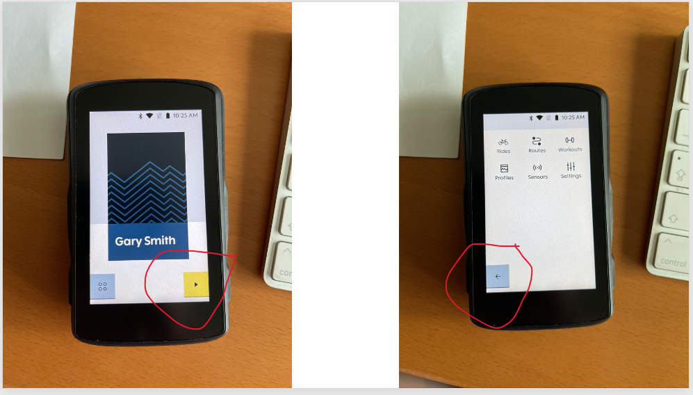
It's the small play/pause in bottom right that I muffed first ride. Sure can see it fine when sitting playing with the device but I'm all fingers and thumbs in gloves and watching the road, etc. and getting the initial brightness 'just so'.


Please sign in to leave a comment.
Comments
7 comments