Use the Space! (How it is vs how it could be)
Answered
Hello,
in general I am really happy with my Karoo and especially the new light mode Update brought good visibility Improvements, but I am growing quite frustrated with bad usage of Space, overlapping UI Elements and a few other things. Especially the elevation Profile Is in need of major overhaul in my opinion, the competition is just way ahead there.
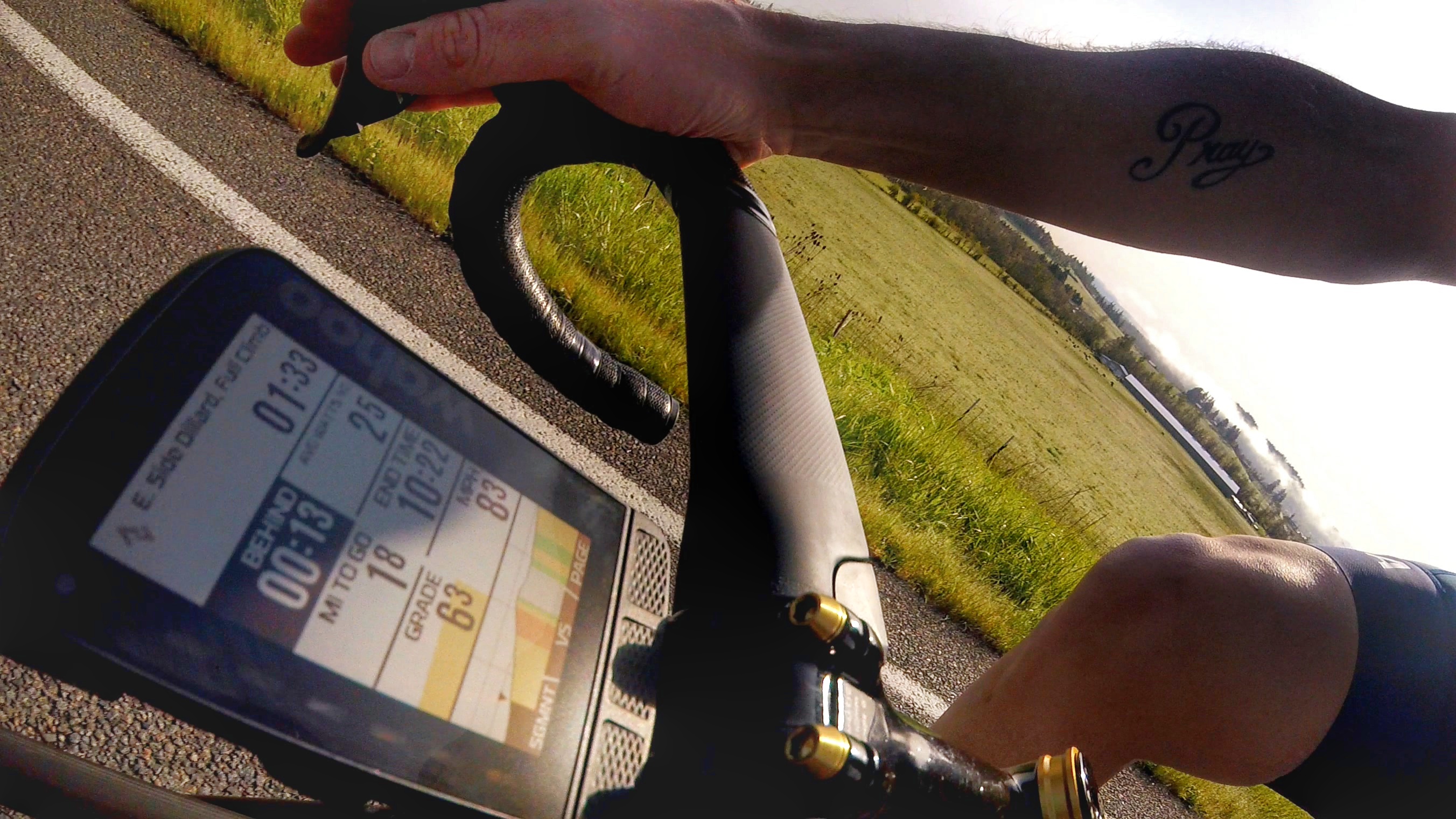
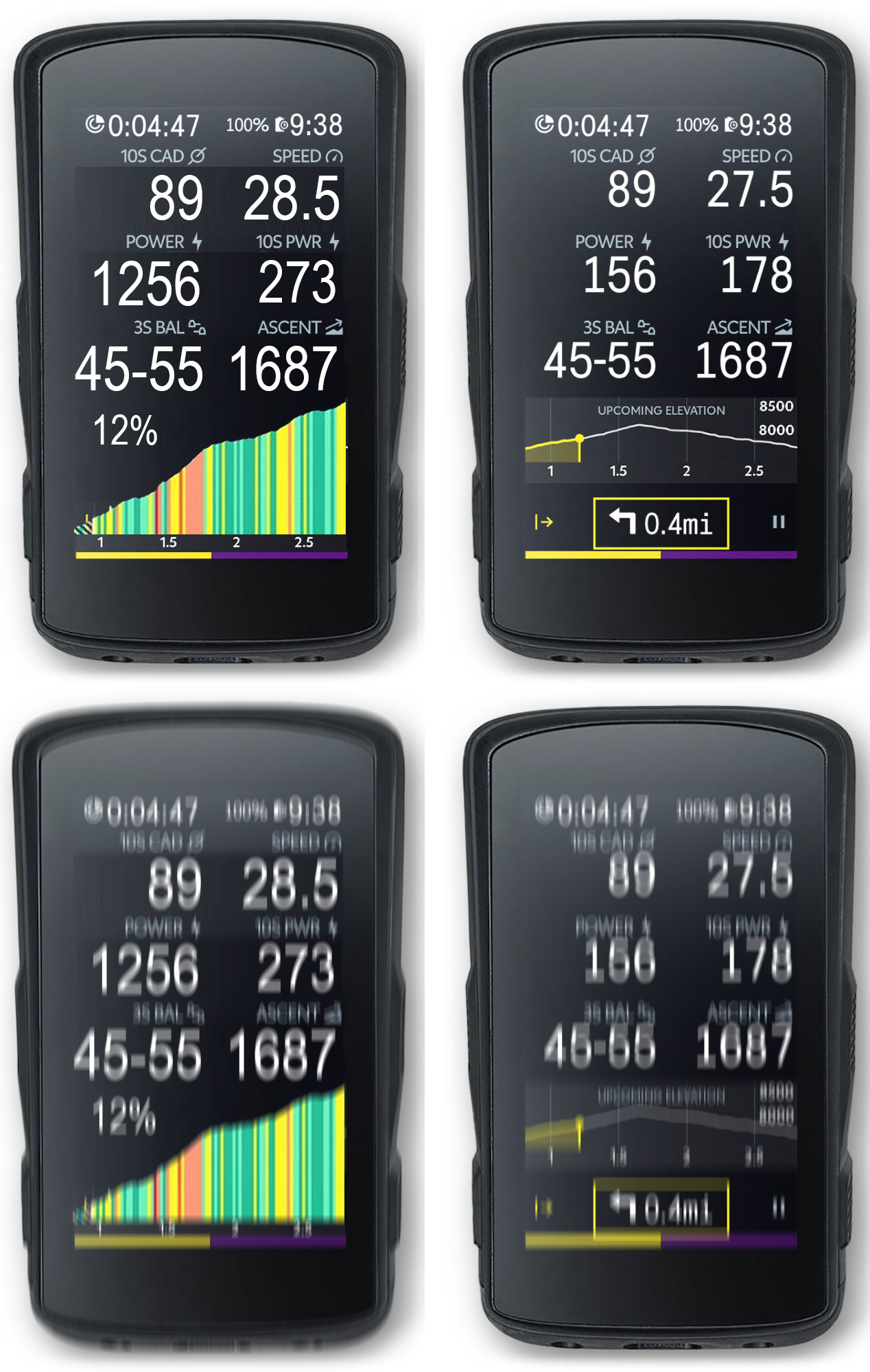
Here a little comparison Picture I made of how it currently is vs. how great it could be:

Bad things currently:
- Loads of wasted space between Rows. I know this is to make Space for the constantly displayed Distance to next turn field, but I don't use it, don't like it and would rather use the space to actually see the elevation profile.
- Overlap of Drawer tabs and Distance at the bottom
- Unecessary Zoom Setting overlay that overlaps and hides the elevation profile. Same for the huge reset button. Neither of them are necessary, since zooming with the buttons is easy enough and I can see my zoom setting at the bottom.
- Upcoming Elevation Banner is not necessary and robs space. I know what I am looking at is an elevation profile and by the position of the dot I can tell wether it is upcoming or historic.
Improvements that could be made:
- Fixing all of the above (main point)
- Adding gradient color coding and especially a fill to graph. This was mentioned a lot of times in this forum already and I do not understand why this is not prioritised.
- Adding small Gradient overlay in the upper left corner instead of the upcoming elevation banner.
- Merge upcoming elevation and historic elevation graphs together. This is long overdue (mentioned a lot of times already and just does not make sense).
Rant is now over, keep the updates coming and thanks for the great support (Listening/Responding to customers)
-

Pit,
Thank you for reading my thread and directing me to this one (yours). I like EVERYTHING you have shown and I hope they will listen to your suggestions. I know not everyone will be happy, but I contend there are UI changes that can be made that will impact the majority in a positive way.
As I stated on my thread, the UI and data fields for me on Strava segments are ... horrible ... if one is into going after segments. the carrot, crown graph thingy ... ugh ... at the height of an effort how do you figure that crap out LOL.
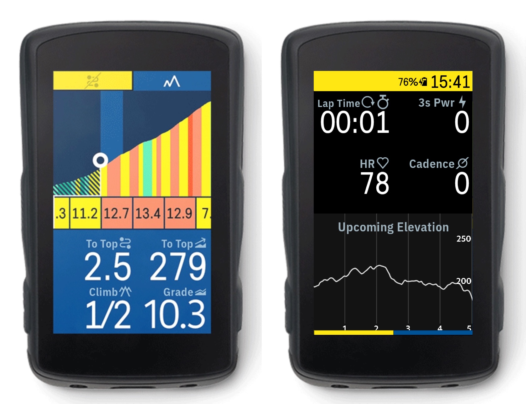
I prefer something that looks more like this. For me, Wahoo nailed this and I hope Hammerhead will make a few changes to get to a screen option with this type of clarity and Strava data.
-

Does Wahoo provide "Most Recent" and "Best Recent" times? Those are what I care about the most. As I'm getting older my PR's from 5+ years ago are getting more and more unreachable! I would really like to just see my PR from the past 12-months. But that's probably more of a Strava thing than Karoo.
-
John Fox I don't believe they show "most or best" recent times but I can understand why you'd like that.
What it does show and what I LOVE, is the "END Time" of the segment. I am a big diesel and have a decent sprint, but I will never take a true mountain KOM. But with the "END Time," I can gauge my effort and know what I have to put in to get to the top of the climb. I can look at my PR and END time and easily surmise what the climb looks like for me.
I really like the Karoo2, but the Strava portion and readability lack so much that I have to seriously consider going back to it until updates come and changes are made. If they are made.
-

My point to criticise most was this incredible waste of space / screen canvas - printing all values and text with huge empty borders around. What a wasted chance to enhance readability. Can't believe HH keeps ignoring us, even now that we have up-voted this point to top of the list... :-(
-
I was able to talk to some People at Hammerhead about this and showed them the following Visualization:
They said that they are aware of the complaints, but did not really commit on doing anything. I proposed making these bigger fonts an accessibility option in settings, which they seemed to like. But sadly it does not seem at all like this was very important to them or they are actively working towards improving visibility/readability.
Another thing I noticed is that in the climber screen they are using a larger font, clearly showing that it is possible on the karoos screen. Also why the hell is one of the decimal separators round and the other one square?!
-

It's sad that HH isn't spending time on such minor but very effective updates.
I think it's 18 months since we got a decent update with some nice new features and or improvements.
Improvements like mentioned above by Marco Soldano are so easy and a win win situation for everyone.
Anyway will stop ranting, no point in shouting when no one is listening.

Please sign in to leave a comment.
Comments
37 comments