UI Color Choices for K2 Low Battery

Yesterday I received a low battery warning on the K2...I try to not charge it after every ride, to hopefully extend battery life.
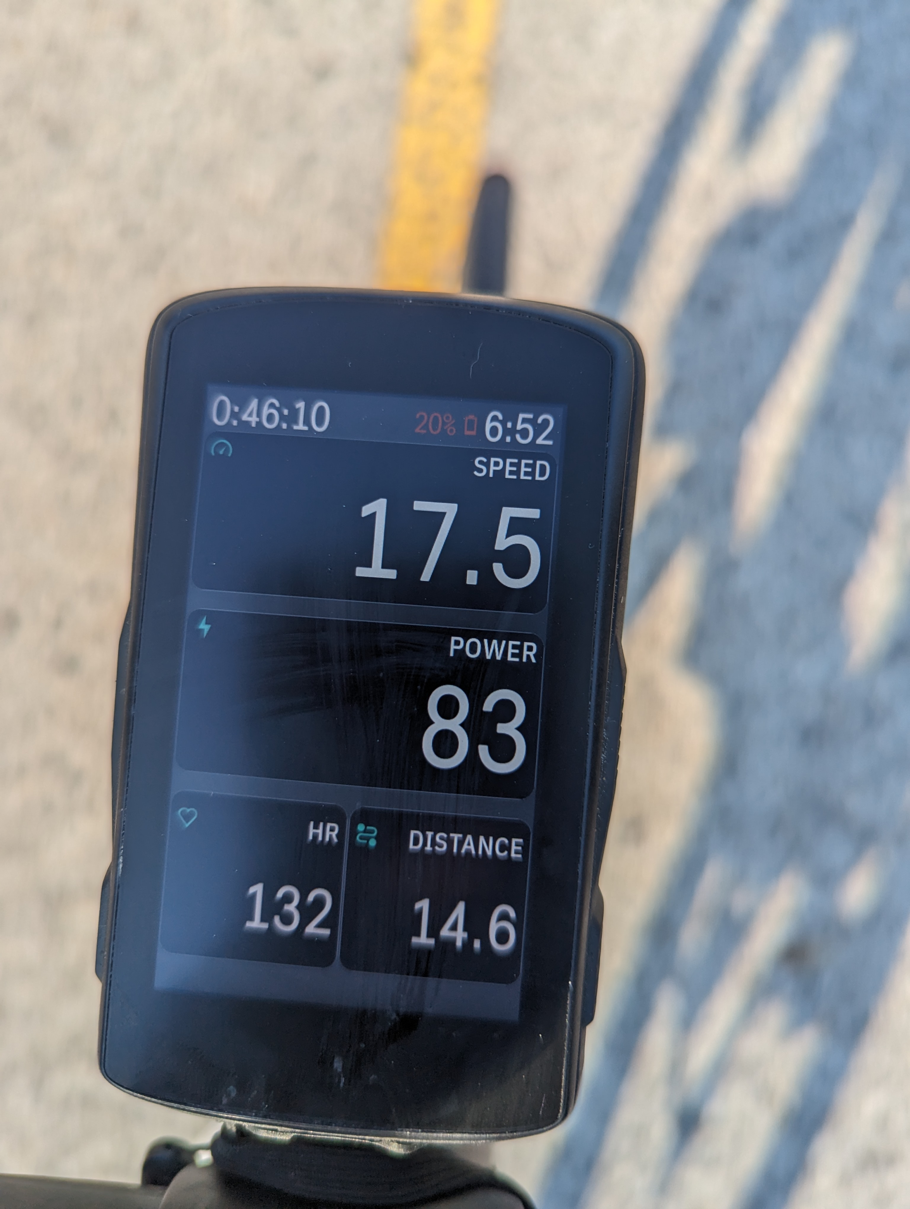
Once the large RED banner across the top went away...I wanted to see what the percentage was....and after looking I truly couldn't see anything there. The photo attached did a much better job picking up on the CONTRAST of the RED on the screen in the SUN...but my eyes saw basically nothing. (I'm sure a bit of glare was there from my angle, the phone is almost straight down.
Either way I think many would agree the RED is hard to read. Could this be addressed with a different STAND OUT UI. I've included an option in my opinion that would be better. The standard text would be there normally....but a WHITE box around the BLACK text would make this area stand out differently.

Please sign in to leave a comment.
Comments
2 comments