Labels for Data Fields
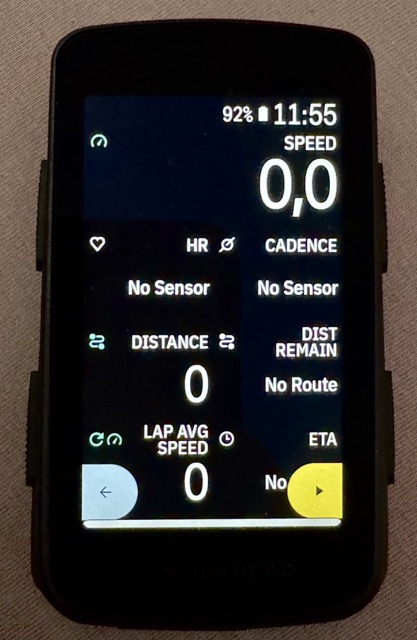
I'm coming from Wahoo (since 2018 Bolt and Roam v2), tried a Garmin Edge 1040 for one day and yesterday received my Karoo and there is a lot of great stuff. One thing that could be improved from my point of view are the labels for data fields: I love the customization options in the settings, but in my opinion even the small labels take up too much space (two lines in several cases):
This gets even worse for languages which tend to be longer, like German:
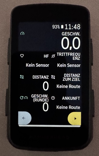
I needed to switch my device back to English, because the German version is far too much text.
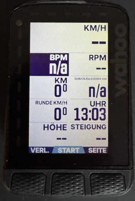
The wahoo dynamically adjusts the text size of the label so that it never exceeds more than one line. This looks creepy when you see it here, but feels totally natural in reality:
Suggestions
It would be great to have at least one of the following options:
- If Android provides a simple solution to mimic the Wahoo behavior (dynamic font size based on available space), then this would be great,
- Otherwise an additional "tiny" option for labels could be a workaround. It should be really tiny, so that at least all English labels fit in one line.
The option I would like to see most is this one:
3. Allow us to hide the labels at all
Reasons, why this is a good idea:
- We already have the wonderful icons for the different field types. These together with the fact, that I've built the screen on my own and so am aware of what to expect there, should be enough.
- This would allow for bigger numbers and so further increasing readability.
-

And by the way: I‘m sure decreasing the „intensity“ of the labels would make the screen clearer, as it would set the labels clearly apart from the values (dark gray instead of black in the light theme and dark light gray instead of white on the dark theme).
And as others stated before: Please provide us colors for heart rate and power. If we do not want colored backgrounds, tiny dots inside the field would do the job. But currently we‘re wasting the potential of the colored screen for simple data pages.
-

Garmin has made a big step in terms of readability. I think it was the step from Edge 1030 to Edge 1040.
They changed to a new font and all the names are in capital letters. This made it much easier to read without having to install a new screen.
This is where Hammerhead could come in. There are fonts that are much easier to read.
-

Please add a feature to select different font family, to use something like Wahoo is using:
https://www.onlinewebfonts.com/download/ded14947b3b3f89d295e95a8e94ab65cThank you.


Please sign in to leave a comment.
Comments
5 comments