climber grade colors

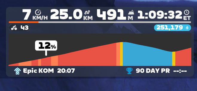
How do you cope with the colours on the Climber when you switched from Wahoo to Hammerhead?
On the Wahoo, the gradients are as follows:
- Green: 0-3.9%
- Yellow: 4-7.9%
- Orange: 8-11.9%
- Red: 12-19.9%
- Dark red: 20%+
Green is uninteresting, yellow ok it goes up, orange hola and from red it's really heavy.
With Hammerhead, yellow is from 7.6-12.5, which is really too wide.
Could you actually configure the colours yourself, I've already got used to Wahoo after several years.

-

Hi,
Thanks for sharing your feedback on the UI of the climber's grades! Currently we do not have the capablity to configure the colors of the grades on the climber. I understand that this can surely be an useful feature to bring onto the climber! Your suggestion here has been shared with the product team for their reference! -

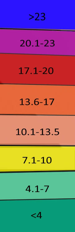
I agree with burkix . You have three colours in use for gradients above 15 %, which, at least in my experience, you very rarely encounter. Most of the climbs are in the yellow - light orange category (7.6 to 15.5%) . It would be helpful if more colours could be spread out over this range.
-

Agree, that they could tweak the yellow category a bit as this range is oddly wider than the other categories. Personally I'm fine with it, but they could shrink the yellow to 7,6-10,5% and change the orange to 10,6-13,5% and than go up with deeper orange from 13,6-16,5% and red from 16,6-20,5% and violett anyything above 20,6%.
But I wouldn't say that the Karoo categories are better or worse than the gradient categories form Garmin and Wahoo, they are just different. I think very few of us can tell the difference between 7.6% and 8% or 11.9% or 12.5% without staring at the computer's metrics. And I like that Karoo offers more categories above 12% than Garmin and Wahoo.
The colors don't really bother me as they are basically the same system as Wahoo or Garmin. It took me a little while to get used to the fact that the yellow on Garmin and Wahoo (about 7%) is still green on Karoo, but in the end a climb is as easy or hard as it is in reality, no matter what color is currently displayed on the computer.
-

First, Hammerhead, thank you for this update. This is a big one. It includes enhancements and features that I will use regularly and makes my Karoo 3 better. You guys are listening to users for which I am grateful.
Don't *need* colors for different gradients, but if you're going to have them, they need to be divided better. Just as others are saying, like .2% are climbing anything more than 12%. There should be 4 colors between 0%-10%, and anything after 10% should be purple or red, something that when I see it I say nope, not doing that today. Ideally would be pretty cool for users to set their own parameters if they so desired. That's my one very nitpick comment. Thanks again for this massive update!
-

Agreed. Whilst climbing this weekend on the bike, I glanced down at my beloved Karoo, and saw just a sea of green. My legs were on fire, and eyes straining to find the gradient numbers, relating to each green shade. Delineating grades better upto 10⁰ or so, would in deed be hugely welcome.
-

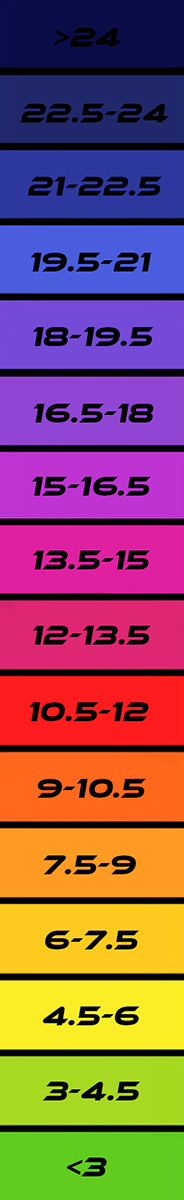
This is a screenshot of the climbing portion of the Zwift display with the colors they use for gradients that I would like to see as an option for Karoo Climber graphic displays:
The progression is blue (less than 1%), yellow, orange, red, flashing orange, flashing red. Flashing orange (15%) should be replaced by glaring purple, and flashing red should be replaced by black.
I don't think the grade spread for each color is listed anywhere. The above is similar to HH climber in that it only appears when on an uphill section.
-

This topic is forgotten and is a neccesary upgrade. The colors zones, at least for road bike are very inappropiate. Maybe we could have different colors zones for the "road" or "MTB" profiles. On the climber page it would be much more sattisfactory have more colors in the 4% to 10% zone. Hope this make this topic revisited.
-
Totally agree. Dont understand yet Hammerhead who is improving continuously this unit have this item of the gradient color abandoned. Its a joke that in many climbs you have all the climb in the same color and the gradient is changing continuosly. Much more innaceptable in road bycicle. I understand in mountain bike maybe the color are more correct.......
-

1.5 degree increments feels a bit overkill. 3 degree increments up until about 12 or 15 would suffice and then after that is just hard and no need to get so granular. Maybe go up to 18 and then greater than 18 for a total of 7 zones. I live at the base of the alps and ride in the mountains a lot and rarely run into long segments above 12%. Sure, I ride steeper gradients but the time spent is small in comparison to the rest and a narrow range would just be annoying to visualize.


Please sign in to leave a comment.
Comments
87 comments