Navigation icon clarity
Answered
Hello, i think the navigation is excellent but would love you to adjust one icon that really becomes hard to see!
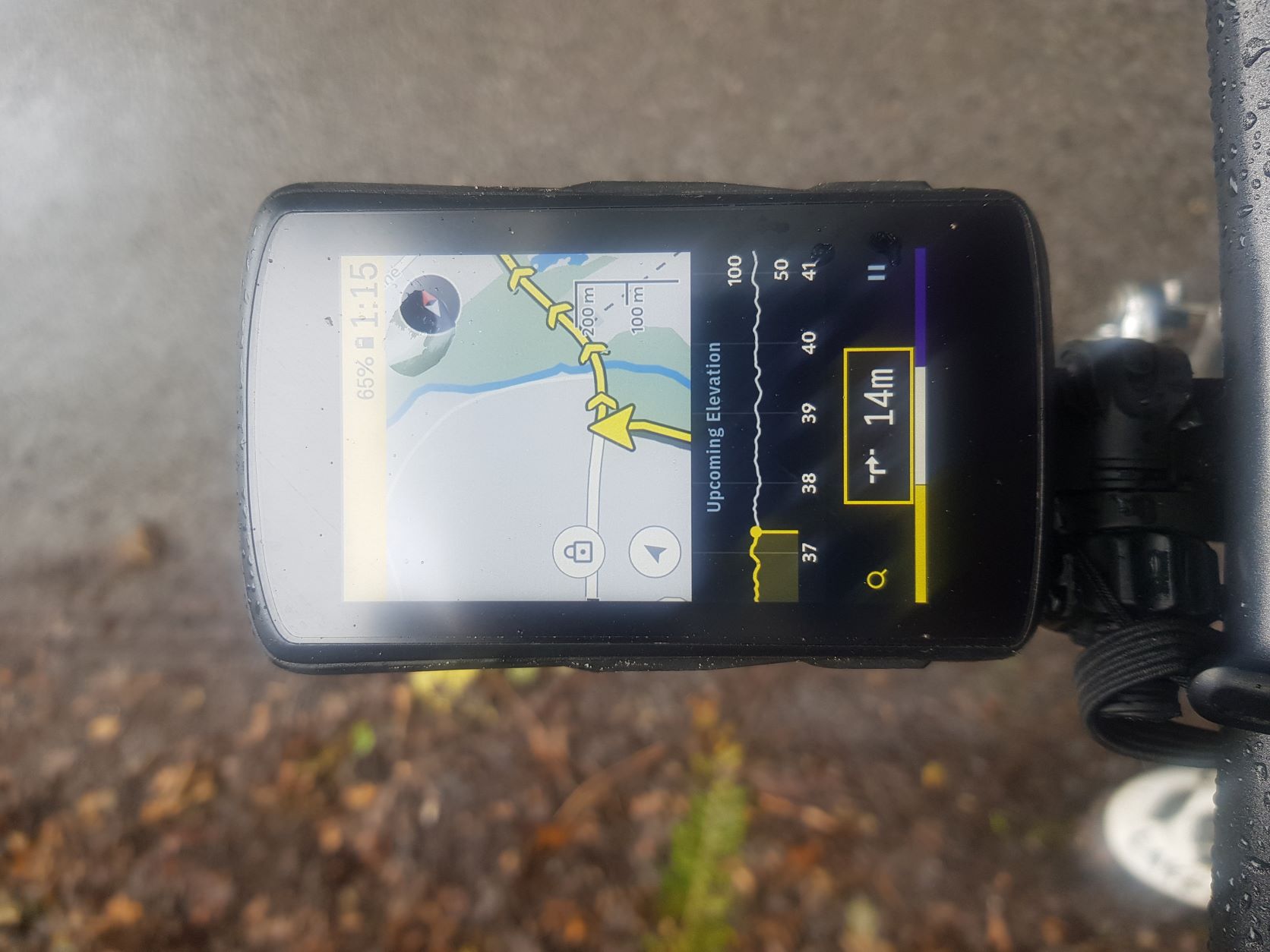
When riding in the rain or even when riding fast i glance down and its extremly hard to read the left/right turn icon due to it having a t juntion running across it, this could be easily solved by changing the colour of the arrow from being white.
Please can this be actioned.
Jamie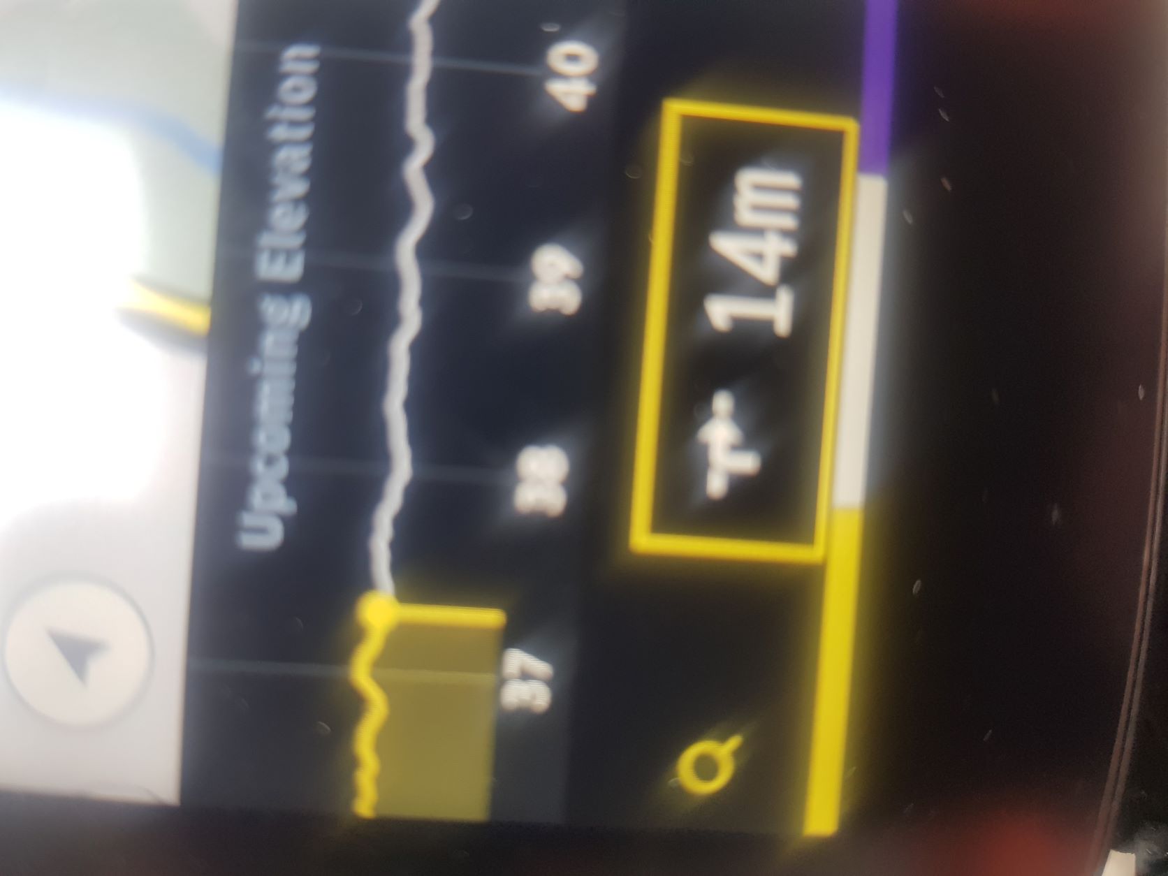
-

Hi Jamie,
Thank you for posting! We are glad to know you are enjoying the Karoo! The improvements on the turn by turn icons have been requested previously as well :)
Our product team has made a note of it and we hope to see this improvement on the karoo in the next UI/UX overhaul :)
-
I appreciate the fact you replied so fast.
If it help it would like to feedback that most of us only glance down to the nav coming upto a junction, i dont like turns poping up over the map and if the tones were improved i would have audio on, currently have it silent as there is no way to adjust tone and volume of each (too loud and shrill currently annoying to me and fellow riders) which if improved would mean i wouldnt even need to look down.
I would love to have the two icons over the map (compass, lock) to be moved out the middle of the screen as i always catch them when pinching bottom left to top right which happens almost every time.
Apart from that by far the best nav system out there.
Jamie
Please sign in to leave a comment.
Comments
2 comments