Screen layout consistency
Planned
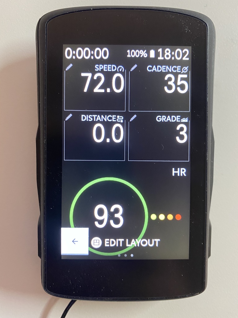
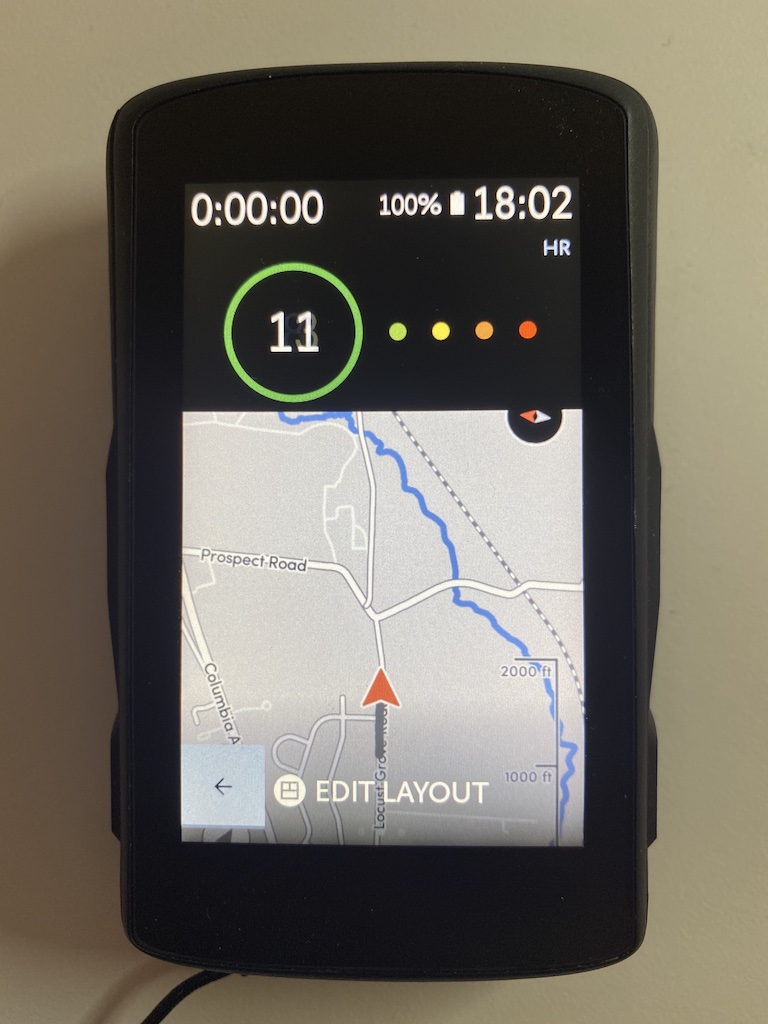
Please can the team add or adjust the layouts so there’s more consistency between map and data screens.
For example, I use the upcoming elevation and heart rate circles. On data screens, these have to go at the bottom. On map screen, they have to go at the top.
When scrolling through screens, I’d appreciate common elements to stay in the same place.


Please sign in to leave a comment.
Comments
5 comments