Light color scheme, elevation profile suggestion
Answered
Hello,
Do you plan to introduce alternative color schemes - i.e. „day” theme with white / light background and black lettering? I find it hard to read in bright sunlight as it is now i.e. black background with white numbers. Also data fields „titles” are very hard to read - light grey with slim, small fonts on dark background doesn’t work too well.
Also - may I suggest an elevation profile „overhaul”? Now it seems you need to have two separate data fields - one for historic, one for upcoming elevation (which is empty without a route). But it all could be done with a single elevation profile if it worked something like this: 1) If you don’t have a route loaded during a ride - make it behave as a historic elevation profile acts now - so just show „past” elevation 2) As soon as you input a route (even mid-ride) the part „behind” you could show real, recorded elevation (as in 1) above) and the part „in front” could show upcoming elevation according to current route. I think Wahoo does this like that in their computers. Now I need 2 separate fields, which makes them less clear because they have to be smaller + one of them (upcoming elevation) is mostly empty and just wasting screen space
-
Official comment

Hello Ivo!
Thanks for the great suggestions! We really appreciate it because we know that some of our best ideas come from our community!
As far as the alternative color schemes and light backgrounds, we have received that suggestion from some other community members as well. One of the benefits of the darker appearance is reduced battery drain - current smartphone OS builds and many apps now have "dark mode" as a setting to help reduce battery drain. That said, sometimes users may want to choose visibility over conserving their battery so I can see where the choice would be good to have!
Combining future and historical elevation graphs as a single field would be beneficial and a much cleaner visual. We have received that feedback from other users and we are looking into it - it's an improvement that we hope to roll in future updates. Keep an eye on our software update release page for all of the latest fixes and features!
We are constantly improving sensor performance, and simplifying sensor management - we have many improvements coming in this regard!
Thanks again for the great suggestions!
Comment actions -
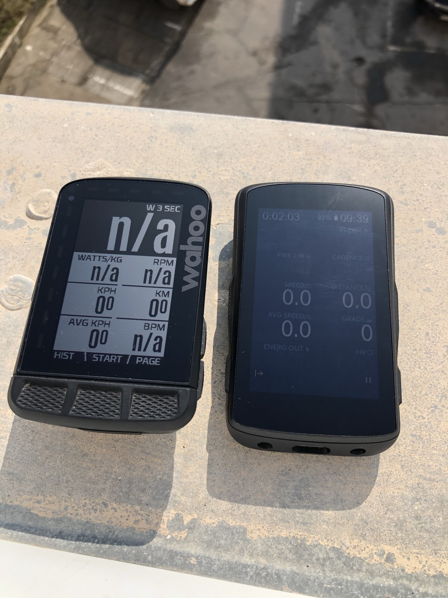
To update this topic a bit - please look at this comparison photograph of direct sunlight visibility to see what I have in mind exactly - on the left Wahoo ROAM, ond the right Karoo 2 with 100% backlight. It's really no competition and Karoo is *really* hard to see in bright sunlight. "Light" mode would at least make it a little better. Now even with 100% backlight (which additionally takes a hit on battery life) it's not really all that visible. I know that ROAM lacks in the mapping, navigation department itp. and overall screen quality / technology is different. But data visibility is most important in the end...
Sidenote - guys and gals - what is your experience with Karoo 2 in good weather riding? Because if it's gloomy outside I tend not to ride outdoor anyways and when it's sunny the thing I care about the most is to actually be able to see the screen...
I really really want to love the Karoo 2 but battery life and screen visibility in good weather might tip the scales and make me return the device. Any tips on how to make the screen more readable?
-
A small „tip” but definately not an optimum solution - today I tried polarized sunglasses lenses with my Karoo (and Garmin which also suffers badly from screen glare) - it VASTLY improves the screen visibility. Combined with anti-glare matte finish of the Karoo screen polarized lenses kill off all the glare and screen is much, much more readable.
I know it’s not optimal solution because the device itself should provide good screen visibility - but you can give it a try, helps a lot
-

Rode with my Wahoo Bolt today, and it was nice to be able to read the screen, including field names. With the K2, the light grey fields are not distinct enough. It's not their font/size, it's simply that they blend into the dark background. (Ref Ivo's picture above). I found that I basically had to memorize the layout. The K2 has a lot of potential, however, if you can't read the screen in bright sunlight it's all for naught.
-
Ok another question as I’m a bit confused by this article:
https://support.hammerhead.io/hc/en-us/articles/360041875274-Light-and-Dark-Modes
When I go to settings -> display I have only 2 options: brightness and sleep timer. I’m on latest software
-

I gave the dark mode another try today because I generally like the look of it. It has been mentioned in this thread previously that the data screen titles are very difficult to read because they are not white like the numbers. The grey or blue does not stand out enough. White, yellow, green or even orange would be better. A choice of color would be ideal but I would settle for white.


Please sign in to leave a comment.
Comments
16 comments