Thoughts on UI changes
The old thread is simply too long to manage, so here's a new one: What are your thoughts on 06/29 UI changes?
Me:
1. Yea!!!! Choices!!!!!
2. Yea!!! They did away with some of the ridiculous two line labels (but not all of them)
3. I wish the Label Size option applied to all screens, not just 9+ field layouts
4. I wish the labels were not all upper case.
But it's a start and that is very welcome.
-

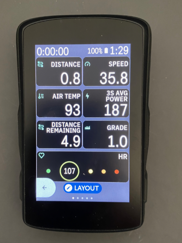
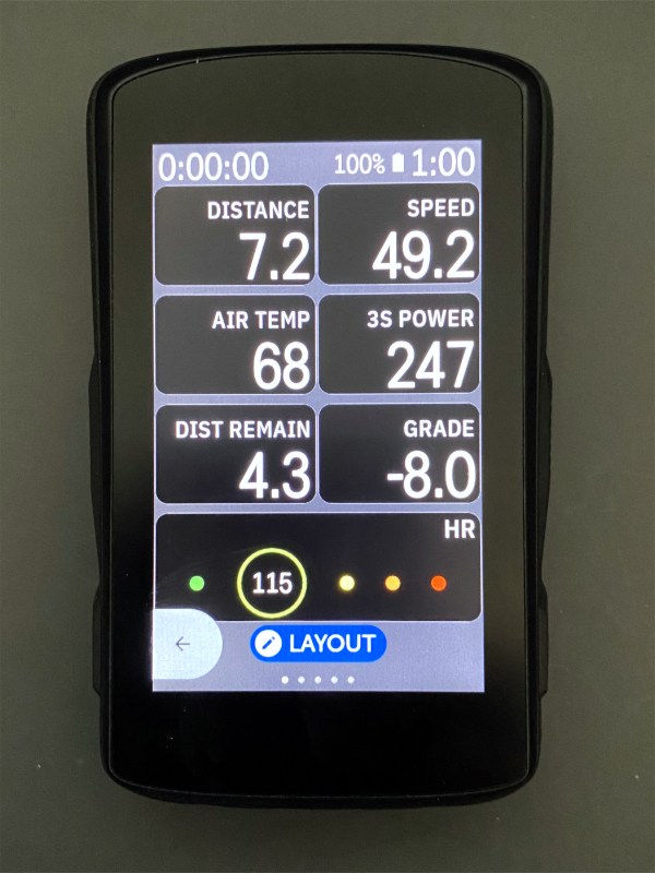
@Anna, a before and after on the 'big thread'
https://support.hammerhead.io/hc/en-us/community/posts/16007939814939/comments/16769277654171
If you never updated to the new UI last time I would still wait a while for potential tweaks and other possible optimisations before irreversibly committing. -

Ok, bit the bullet (if even you like it Lee, how bad could it be...), don’t like to have pending updates hanging.
Close enough, the digits still feel a few px smaller than before with 10 fields but I might be imagining things, and anyway no big deal. The labels are still too prominent though, would strongly prefer to get them appear significantly less bright than the digits (like before), plus I have complained about the ALL CAPS thing already before this.
Anyway, props to Hammerhead for responding this quickly rather than sticking to your guns, “would you recommend” score back from NaN to 9.
-
Have to revise my earlier comment after the first ride with the new UI, the labels don’t really bother me (dunno why they looked so much brighter indoors), but the still slightly smaller size of the digits is definitely noticeable, but I guess I can live with that.
Also in good news: the current position on the map screens is now much closer to the middle (spot on with 2 data fields, slightly too high with 4 and too low with none). At least when using north-is-up orientation, and actually I think it is okay even for forward-is-up, seeing more of the map in the forward direction is only useful when heading pretty much straight ahead whereas around something like hairpin turns it gets more random.
-

Someone correct me if I'm mistaken in this; but you can (and I have) turned off the pop-up turn-by-turn prompt in my settings. Also, back when I had it turned on, I could swipe down to dismiss the prompt and only leave the smaller upcoming turn indicator that doesn't cover anything.


Please sign in to leave a comment.
Comments
13 comments