Do you like the new "in-ride look"?
I always try to be positive about new user interfaces. I always try to recognize the advantages of new UIs. In my previous job I designed a lot of UIs.
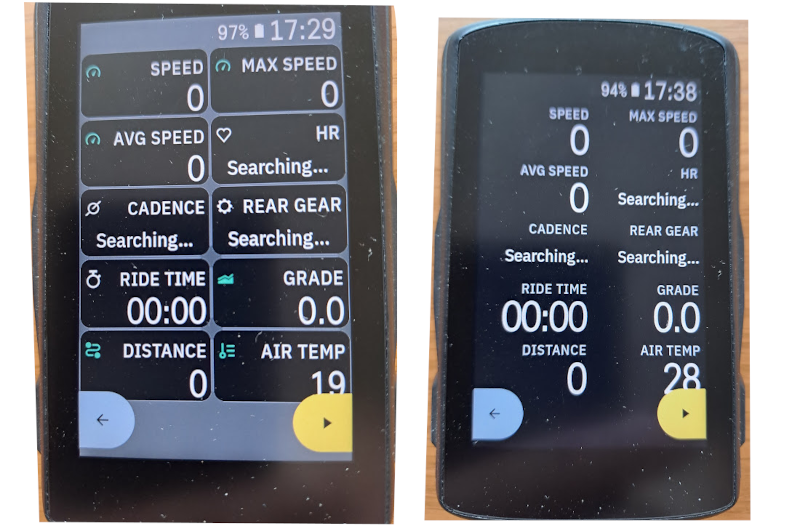
But this new updated UI does not work for me. The legacy UI was a very good looking UI (It had some roughness, but was a nice, modern UI). The new rounded corner boxes are pointless, the grey background color is ugly, and not harmonic. The legacy UI was much more modern this new UI is just old fashioned and outdated. The large upcoming elevation graph black background on a black screen looked very good, the new grey graph is just ugly. The legacy UI gave higher contrast feeling, the new grey color brings low contrast feeling.
My suggestions for Hammerhead are rethink and tweak this new UI and/or make an option to use the legacy UI (my main buying decision to Karoo was the good looking UI). The best would be it you keep the style of the legacy UI and make small updates and error corrections on it. It the new boxes layout is a must have (for future functions), you have a much more better way to design a boxed layout.
Please review this new UI!
What do you think?
-

I think that the users that the last update has "hurt" the most are the true fans of the brand.
For my wife, the Karoo is just another bike accessory, and she really wouldn't care if it was Garmin, Wahoo, Bryton, or whatever bike computer it was. Look at the kilometers, punctually navigate a track and that's it. She is not even aware that her cyclocomputer does not measure the accumulated height well...
But for many other users, for whom cycling is part of their lives and who love technology, they have felt identified with the brand since its birth... a different and simple way of doing things, taking care of the details that matter most.
The feeling of this last stage is that Hammerhead has lost some of this direction and spirit. I think that some time ago, what happened with the last update would have had an earlier and more constructive response from the company. Many promises arrive late or do not arrive at all. Bugs reported for months and with easy solution, they are not paid attention to either. A translation announced 1 year in advance arrives poorly integrated and with many visual errors. Hammerhead is no longer that small company by and for the community. It seems that things are decided in high places and we do not feel part of that path that we have been traveling together. The feeling is that things are not done with passion...
I agree that the last thing you can do is lose respect. It is also true that until this update there had never been a "commotion" in the forum. In general, forcing users and not allowing them to decide is not a good practice. I hope and wish the best for Hammerhead and continue to enjoy many years of his devices and work done.
-

@Toni, i have de same feeling, what it was doing with passion it was lost. For me its late now because i think that all company like to doing the same of garmin. They going in the same direction but never forget that garmin is not a simples GPS company, is only the one and only that make to all sectors a GPS functions and make the world routing. HH it was a clear ideias and make me think that some one want to make the diferencie, 2 years past and nothing to make this device a diferent one from the others. There aren't the same feeling when i put the Karoo2 on bike. I Keep arround this foruns, but the Karoo2 is now in the box.
-

Putting Our Users First
We listen to our users and act on their feedback, so the Karoo 2 always meets your cycling needs.Hammerhead posts the above on their webpage. I hope they will renew their commitment to the above words and make the changes their users have been asking to be added, fixed or changed for months.
-
@Benno HH don't let us downgrade because the next Step is Forward and not Back. I think that they can't assuming that the last upgrade was an authentic commercial fiasco, they try above all to maintain Karoo2 sales with the value reduction promotion. Unfortunately, until now, they have not been able to accept the mistake and report whatever it is to the community that helped HH to grow as it has. Not an official statement. Hopefully the next upgrade.
-

@Benno because they say "We cannot roll back the Software, as we do not want break the stability of the multiple tools interacting together." Side-stepping whatever tools are being referred to, their awareness that updating forward doesn't (and has in the past) broken stability is just beyond logic.
-

Seriously HH, this last upgrade has turned me from a
"would recommend Hammerhead 100% to all my friends" (as it was before)
into
"never mind, I'll wait until at least this is fixed"
Reducing font size on essential data fields SUCKS (and yes after a few rides we DO know where the fields are and we DO NOT need huge labels to tell us so...).
Please make an option label font size / Data font size or make labels optional all together, using real estate to increase data field font size.
To emphasise my opinion: You just made the best cycling computer into a gimmick, please reconsider and also please: respond in a serious manor to this thread, do not ignore your user base, PLEASE -

I'm wondering what user feedback led to these changes. I suspect none. I can't imagine someone who actually uses the device asking for smaller data fields and two lines, larger fonts and longer descriptions for field labels. So who decided to spend developer hours designing and implementing this regression?
-

Just wanted to add my name to the list of people hoping for the return of the 'Classic' UI on the 29th. I had been considering upgrading to the predicted Karoo3 as HH had finally delivered E-bike support after literal years of delay. Integrated AXS gears, live Tirewiz readings. Things were perfect at last - for a little over 3 months! It's sad.
-

So in my opinion the look is not the biggest problem of the update.
It is just the all around wasted space in the tiles and too much space between them.
Labels are for me a total waste of space also. An option to completely remove them while riding would be perfect. I know where my dada is on the first glance and I’m not interested to see what data it is because I configured it so show exactly there…Also the little icons in the label is just a nice to have but totally unnecessary. If a sensor is not available it is shown in red, but I already know that it is missing because I have no data shown at all. 😅
I just wish for a slightly updated UI of before this last update with bigger or bold font and better usage of space. The nice and much better looking UI compared to Garmin and Wahoo is hopefully not gone forever. 😢
The moving around of data fields as a possible reason for the update makes no sense to me. I set up the data field the way I want it once or adjust it after the ride if I need something different. The already available option to set it up is much better compared to Garmin and Wahoo.
In the end this update all around was not needed and I would prefer to get the available 🐜 fixed instead (wrong elevation gain as an example) or get the additional long time wished option to disable rerouting (which would be great for races,…).
As Hammerhead-marketing is also not using the new UI in all social media profiles, Webshops and the own Homepage it does not look like that important…Please Hammerhead get this UI thing sorted quickly and then go on with important stuff (bugs) instead of unnecessary annoyances for the people who love this device!
-

Smaller digits and more visual clutter (bigger and brighter field labels and icons plus the borders) are mainly what I certainly was referring to as well when complaining about “the look”. Not sure what the map+data layouts would look like with my settings since I’m still on the old UI, but if the map area gets reduced, that’s of course a problem as well (especially if you can’t see where you are going when heading anywhere from SW to SE when using north-is-up orientation).
The buttons/borders I especially don’t understand, after all it’s at most a 2x5 grid, not a spreadsheet...
-

Is it a bad sign that I rushed to the release notes page immediately after waking up? It might be released later today. It's a holiday in India followed by a holiday weekend in the US...
Side note: I wish the Karoo would dynamically zoom in and out on descents. It would be helpful to see the next turn or two and then zoom back out to the normal level.
-
The update is now live and I've installed without hesitation because anything is better than the last one :D
https://www.uk.hammerhead.io/blogs/change-logs/karoo-software-build-version-1-395-1557
-

I very infrequently post here, and the ranting that's gone on over the new look is one of the reasons why.
But I do very much appreciate that hammerhead has listened through all the whining, people threatening to hold their breath until changes happen, and made the changes.
However as I said in another thread I do like the new look I like the framed look to each field.


Please sign in to leave a comment.
Comments
314 comments