[REQUEST] Proposals after 29th June update

Dear Support Team.
I have 2 requests for you, to share with Production Team...
- The cursor "arrow" on the map... now, it appears centred. For me it is a problem, because I want to "see the road ahead" ;-) Previous position on the bottom on the map is better for this purpose. BUT... when discussing it on a previous post, I realised there are users that need it on the centre on the map, because they use the map always oriented to the north (north-is-up). I think it could be made easily configurable, at least this two options (centred and bottom). Or maybe make the position completely configurable, dragging it on screen and then blocking the position... it's only an idea.
This is the old post about this, recently updated in comments since last software update: https://support.hammerhead.io/hc/en-us/community/posts/9056949265051 - The next turn indication could be beside the arrow, with a transparent background on a map bottom corner, or on a top corner like other navigation gps... Maintain the indication very simple as it is now, and not very big, in order to save map invaluable pixels. And I think, also configurable. I can imagine very much people happy with it as it is now... but maybe others like me prefer an small indication on a corner of the map.. or nothing, because I love the indication, but, I love more the map with the road ahead :-D
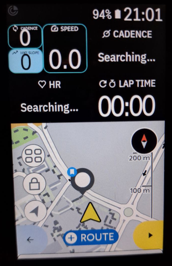
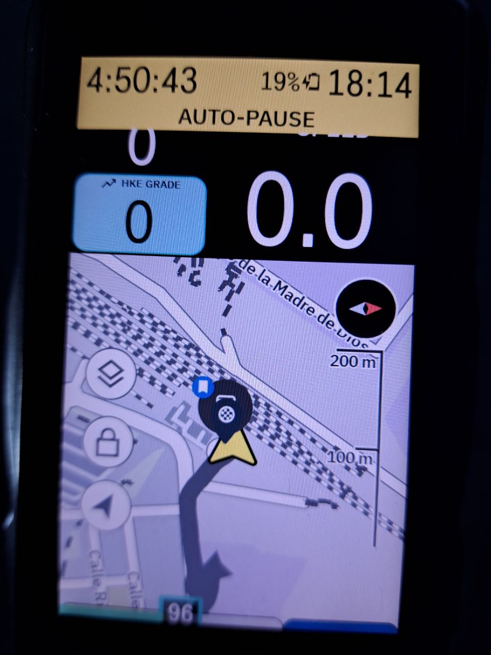
For illustrating these 2 points, this is a picture of karoo in April, with cursor "arrow" close to the bottom, and turn indication occupying so many pixels (sorry for the sunlight):
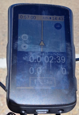
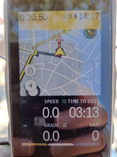
And this is today (without the turn indication), I had to incline the view a bit to see a bit more ahead... You can see all the wasted space below the arrow, it's a pity.
Thanks a lot for your dedication.
Best regards.
-

I also feel unhappy with the even more upwards position of the arrow on the map.
To my knowledge, the only way to get more map ahead is to change the map profile view to data fields in the top of the screen and not on the bottom.
Problem with this is eg the climber drawer function overlaps with the arrow position when activated during a climb.
Annoying to navigate without seeing an arrow.... . -

Imagine something like entering a roundabout, going almost full circle, and then turning right (or left if in Lefthandia) again shortly thereafter. If the current position is near the bottom of the map, you might lose visibility of that turn as you approach the roundabout and won’t see it again until you have completed most of the turn there.
That being said, putting the marker *above* the middle (with 4 fields below the map as shown in one of your photos) is just weird.
But what I would want most of all is just to get the digits back to the actual original size...
-

Again and again: Yes please. Cursor to the bottom and finally use the big display what it is made for: See The Road Ahead...as much as possible (without zooming out!)
-> and for the users that love the central position keep that as configurable option as well, so everyone should be happy
-

I thought I had configured something incorrectly as the position marker used to be correctly positioned close to the bottom of the screen. Has this just happened with the 29th June update? Does anyone now have the position marker at the bottom of the screen or is it in the middle for everyone?
-
Hi @Paspa, it is so curious... maybe it is the best workaround approach right now, just configuring map page. I verified it on my karoo. Very curious... Any other map layout don't seem to "work", and maintains the cursor in the middle of the map. At the moment, I'm going to have the same layout with the arrow cursor in the middle, but I hope HH revert this as soon as they could, or at least, make it configurable, that is much better for everyone.
Regards.
PS: Climber or any other notification, always hide anything you have at the bottom of the screen..
-
27.07.2023
Fresh update and the position-arrow still not improved.
The position arrow ist still in the middle and still wastes half of the screen...
...and the North-Is-Up-Users additionally have now new problems when additional datafields are used.
I would say, a loose-loose update :-(
-
Hi @Andreas, oh, it seems you're right... I saw it on my karoo, with 2 lines of data fields, cursor is near fields, at bottom, but with 1 line of data fields, cursor remains in the middle (¿?). It's a bit weird, as only a part of the job was done. HH need to check it again...
Regards.
-
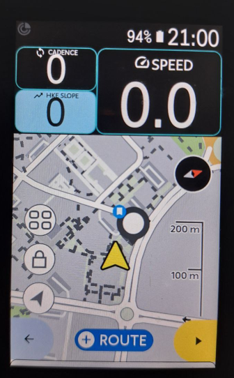
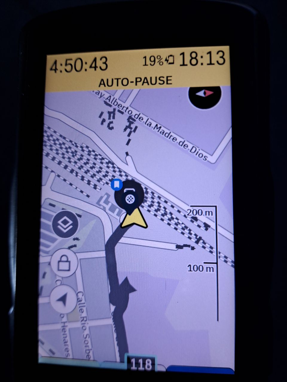
Hi, I recently tried a layout with only one (big) row of data up, and then remembered that old requirement... With 2 rows cursor/arrow seems ok, but with 1 row, cursor is quite centred, wasting pretty space below. ¿Why don't move the cursor a bit more down? ¿It's already considered a configuration option to position the cursor on screen?
Thanks, regards.
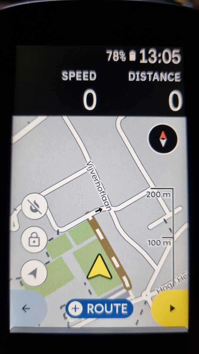
For comparing, 2 more examples
With 1 normal row (same centred position):
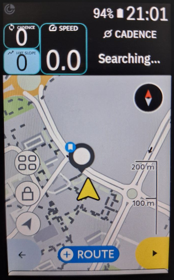
With 2 rows (cursor/arrow almost at bottom, ¡yes!):
-

Put the data fields at the bottom to make it REALLY UGLY 😁
Look at the image, the scale ruler is cut off and to the left and right of the navigation arrow a completely useless part of the map is displayed.
I still can't understand how such a hidious layout could ever get past the quality control. Maybe they were totally drunk?
BTW, which extension do you use for the top left data field?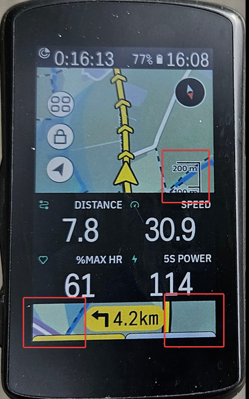
-
Ufff @Frank, I think it's quite awful. Did you see the pics I took on the first message of this post? They are too long ago, but the map screen with 2 rows of data located below looked better than yours!
The extension I use in the previous message is Vin HkE. You can follow news about it in its own post... it's improving everyday, both extensions and the official API are quite young...
It's a multiple value field (triple) that I allocate on the map layout with the only (and big) field on top, I will illustrate this with screenshots from hammerhead's layout post:
In this example, instead of Elevation legacy field, I use the customised field from the extension with cadence, slope and speed.
This is a single feature of the extension, that has many of them. There is another extension (simpler) similar to this multi-field feature, the KDoubleType Extension, for your consideration. I didn't try it yet, but sure I will.
Regards.
-
Hi HH, I'm still missing the option to put the arrow-cursor down in the map. These pics are recent, last tuesday on my K2... it doesn't matter if fields are shown or not in the map, the arrow remains centred and you can't see the road ahead, it's very frustrating. According these topic and searches on the community forum, this is a feature reclaimed a long long time ago, all we are expecting this feature on any of the newer system updates... but...😢 Please, consider including this option. Thank you.


Please sign in to leave a comment.
Comments
21 comments