Applications of interest to the community
I open this thread if the administrators agree, to publish here the functionalities that we would like our devices to have, with the intention that external developers can provide solutions aligned with the interests of the community.
If it is of interest, you could even put it as a featured topic, with a pin.
I start requests with a feature that I am very interested in.
- CYCLING DYNAMICS. Power Phase.
-

I would like to have an optional layer on the maps page that show me a grid for tilehunting with statshunter. This would be nice, because then I would know during my ride if I have catched the tile.
A better Idea instead a layer on the map is a separate datafield that can display statshunter like Google Chrome does on a smartphone.
-

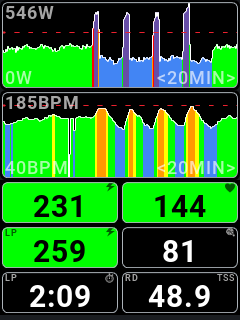
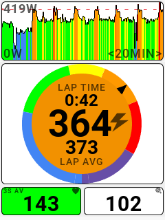
I've posted this in another thread (sorry to @timklge for hijacking his post on the fantastic power bar graphic he made!), but figured I should post the request here where it actually belongs. I would really love to see some graphical widgets added to the Karoo for power and HR that are training-focused. I'm including some screenshots of exactly what I would like to see for the Karoo (screenshots taken from the discontinued Stages L200 computer). There are two different graphics here that I'm focused on:
1. A color coded (by zone) graph of either power or HR over time (user can select which metric). The time scale can be selected to show either 5, 10, 20 or 60 minutes (example screenshot with dark background shows these in the top 2 data fields, the light background screenshot shows this in the very top data field). Garmin also has something like this but their execution is terrible and the time scale is limited to 90 seconds which is far too short to be useful.
2. A color coded gauge (user selected power or HR) that shows current (instant) power (or HR) as the big font number with lap time and lap average power (or HR) as smaller fonts and then the gauge face color is based on zone and the perimeter of the gauge shows a little arrow indicating where in the spectrum of zones you are at now. This gauge graphic (light background screenshot, middle graphic) is hands down the best single data graphic I have ever seen for power or HR training. I have used every major high-end cycling computer on the market and nobody has anything even close to how useful this graphic is for interval training.
I think these graphics cold look stunning on the beautiful Karoo screen and they are so helpful and functional for training both outdoors and indoors.
Quick note of appreciation: the developer community here for the Karoo seems to be very capable and quick given some of the really cool things already made and the SDK for the K3 only came out barely a month ago! This developer community is awesome and I'm already thankful for all the great work!


Please sign in to leave a comment.
Comments
6 comments