Why are my data fields now shown with a huge space at the bottom?

From the moment I purchased my Karoo 2, the data fields block was aligned at the bottom of the screen. But at some point, with some software updates, there is now a very annoying space between the data fields block and the bottom of the screen, with some wasted map space and screen space.
How can I move the data fields block to the bottom of the screen again to have a full view of the map above the data fields block? The current situation is annoying and it wasn't like this before.
I've tried editing the profile and the data fields but no success.
Any ideas?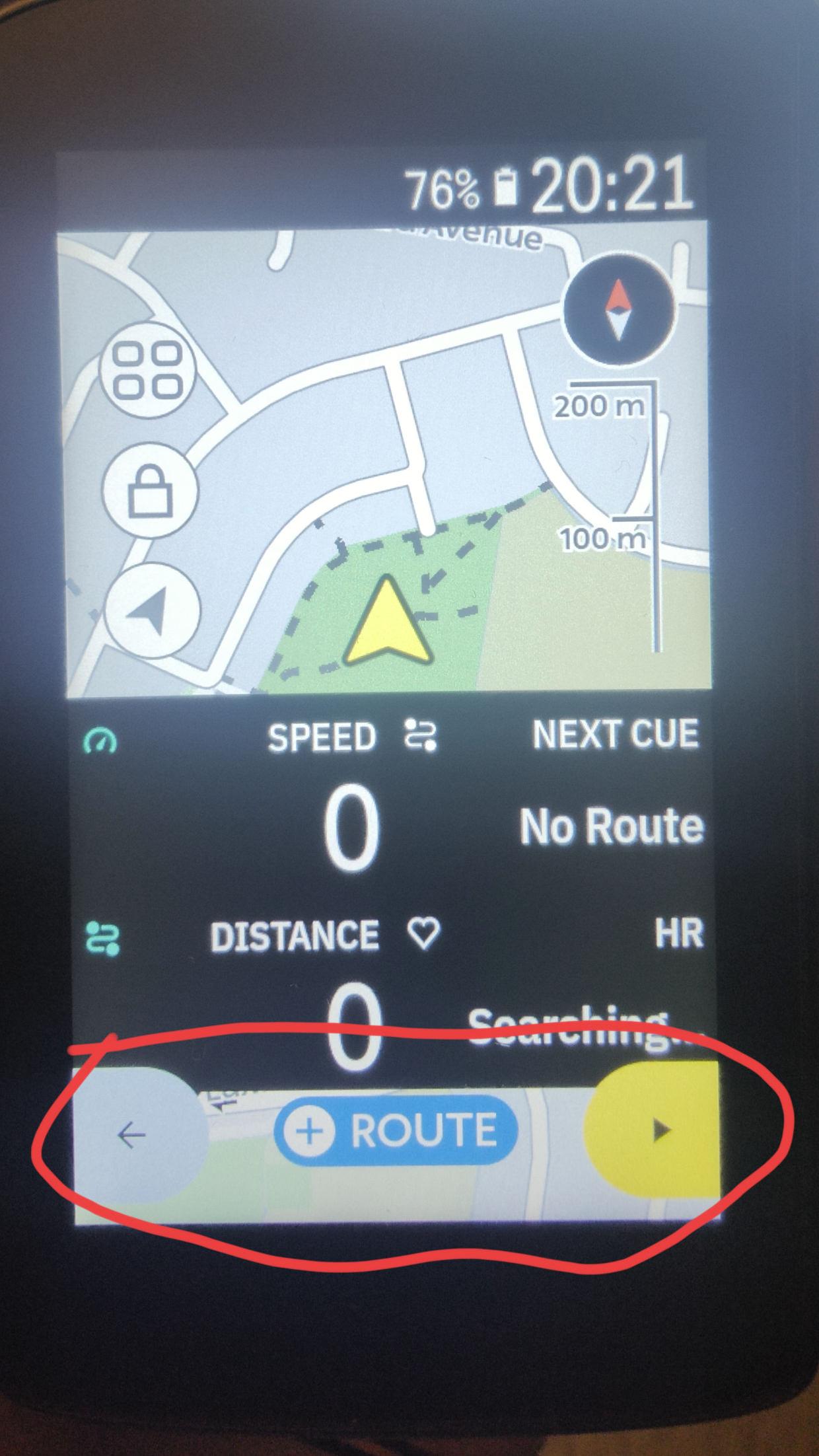
-
Thanks Ali.
I think the same happens with boundaries off. Do you know if using a different data field layout (2 data fields instead of 4) would have any impact? The current situation is quite a poor user experience.
Thanks for sharing this with the Product Team. Hopefully they agree this needs to be fixed. -

Hi Alberto,
have you tried to turn the Key Button icons off?
https://support.hammerhead.io/hc/en-us/articles/25642638526235-Karoo-OS-Key-Button-Icons
When turned on, the datafields move upwards as shown in your photo, whereas when turned off the data field move nearby close to the bottom of the screen, even when you press one of the buttons and some Key Button icons are shown on the screen.
-
Thanks Thomas. That was really useful and has definitely helped.
I have turned off the key button icons and the whole data field block is now closer to the bottom of the screen. Now the wasted space is smaller although there is no reason to keep to keep that wasted space on the screen. -

+1 for "space is wasted". I think there can be a more convenient design to not waste the space once the fields are on the bottom. Another option would be to have the fields on the top but then the position arrow should move a bit more down on the map so you see more of the map ahead which is much more useful then the map behind your current riding position. In my opinion, this is anyway the case, maybe this could be shared with design team - there is no real use of seeing the a lot of map "behind you".

Please sign in to leave a comment.
Comments
6 comments