climber grade colors

How do you cope with the colours on the Climber when you switched from Wahoo to Hammerhead?
On the Wahoo, the gradients are as follows:
- Green: 0-3.9%
- Yellow: 4-7.9%
- Orange: 8-11.9%
- Red: 12-19.9%
- Dark red: 20%+
Green is uninteresting, yellow ok it goes up, orange hola and from red it's really heavy.
With Hammerhead, yellow is from 7.6-12.5, which is really too wide.
Could you actually configure the colours yourself, I've already got used to Wahoo after several years.

-

This whole thing is just a visual (graphical) representation of the climb inclination, nothing more. So it's not hard to code it. So user enter "gradient value from-to" and selects corresponding color, and repeats X number of times - I don't see any issues here or possible bugs.
I would still go with customizable type, as Klaus proposed.
-

Just because you don't see (how to make) one, it doesn't mean there cannot be one. I have seen so many simple function logic with bugs ... ;-)
Anyway, it's more on a global scope: the more complex something becomes, the higher the chances for a bug. Also, coloring gradients on a user-defined pattern requires more processing than static lookup. It's not a lot really, but if you make many things slightly more complex, at some point you'll notice.
For me, anything is fine, but I don't really think it's worth it. Most people will be happy with a more "logic" and fine-grained color-distribution. I just think the time could be used for implementing more relevant features.
-

Hola.
Bajo mi punto de vista, el tema de colores es una cosa a mejorar, me parece que son unos colores que ni están muy bien equilibrados con la realidad, que un 7% sea un color verde dista mucho de lo que cualquier cicloturista pueda considerar como asequible y creo que en las subidas te engaña. Espero que puedan modificarlo y poner una escala de colores más adecuados.
Gracias -
I would have max 12 different type of gradients ranges & colors between 3 and 23 degrees would be more then enough. And I think that making things customable (each one can choose its own colors) would complicate things even more.
So I would go with solution like this:
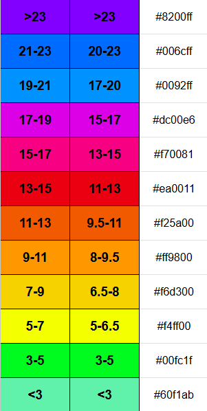
I would say colors also make sence, and are in some color pallete order. Personally I would go with 2nd column, it has more packed up graditents in the grades where we ride the most of the time.
Here is also an excel file.
-

If HH implemented a grade chart with 12 different ranges, I would be looking for a new bike computer. I would like to know how many riders have a need for the last 5 on a regular and sustained basis. I live at the base of the Italian Alps and never encounter meaningful sustained segments above 15 percent. Sure there are gradients that go higher for short distance but a 2 degree color range is not going to add anything to the experience. I don't understand why there is a need to reinvent the wheel here. The Karoo ranges are currently off but every other manufacturer has a reasonable color chart. No need to be different. All I, and most likely other riders need to see beyond a certain point is red or purple, and we know it is going to hurt.
-
No considero que sea necesario un campo personalizado, con que fuera algo por defecto valdría, pero algo con colores más sensatos y visuales, considero que subir un puerto con un 7% de media no debería aparecer en verde, algo en color verde es algo asequible que incluso sirve para soltar piernas y descansar, en mi caso, un 7% es ir forzado, bajo mi punto de vista, desde el 19% me sobran colores…. Por ejemplo Garmin tiene 5 colores y es más que suficiente, pero no se tratará de suprimir o añadir, simplemente de rediseñar la paleta de colores a algo más visual.
Gracias.
-
And as on the first page, I am with you, Frank. :-) I prefer constant/equi-distant steps, and I find 3% a good compromise. Likewise, Mitja's color palette would fit well (omit the light green and the step between orange and red and this fits the 3% steps). Regarding other comments, I just wouldn't make it overly complex.
-

Hi All, Thank you for sharing your valuable suggestions.
I have shared your feedback with our team. While I do not have a timeline at this stage regarding whether or when this will be included, please be assured that your input is important to us as we continue to improve the Karoo and its features.
Please keep sharing your suggestions.
-

New user here. I've gone about things back to front as I raised a ticket about this before finding the forum. Support have been very good, but the response to this is effectively that coloured gradients exist. Well yes, they do, but the range is too broad. Coming from a Garmin /Wahoo user background I can definitely compare how the graphics relate on known local climbs. I'm used to noticeable differences on the climbs on the routes I do, but on the HH, it's just a sea of green. Very unhelpful. Hopefully one of the many good ideas in this thread gets picked up.
-

Thread Bump - Any plans Shrammerheads please, for the Climber Colours to be upgraded. Plenty of great options presented in this forum. All viable. I feel simplicity and, above all, realistic // Real World colour graduation is key. Not many 23 degree hills being tackled on a daily basis by most of the cycling population.
For my part, I still like the Zwift implementation.
Gradient Colour ScaleThe colours generally follow a "heat map" logic, where cooler colours mean flatter terrain and warmer colours mean steeper climbs:- White / Light Grey: Flat or near-flat sections (typically 0% to 2%).
- Green: Slight inclines or false flats.
- Yellow: Moderate climbing (often around 3% to 6%).
- Orange: Steeper sections (usually 7% to 11%).
- Red: The steepest parts of the climb (generally 12% and above).
- Additionally - Dark Red - for anything above 12%.
Responce from HH really appreciated, and as one comment above mentioned - timing heading into the 'Outdoors' 2026 season would be just perfect! Thanks for considering.
-

Maybe everyone one of us has to raise a ticket to them. This could mean the work effort replying to those tickets gets bigger than implementing this feature and they do it. ;)
Anyway, I don't really understand not implementing (or simply changing the numbers to the colours as for now - needs minutes?) this with little effort but large impact. It is evident that nobody would consider12.5 percent as yellow but rather as red.


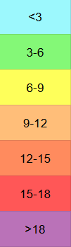
Please sign in to leave a comment.
Comments
87 comments