climber grade colors

How do you cope with the colours on the Climber when you switched from Wahoo to Hammerhead?
On the Wahoo, the gradients are as follows:
- Green: 0-3.9%
- Yellow: 4-7.9%
- Orange: 8-11.9%
- Red: 12-19.9%
- Dark red: 20%+
Green is uninteresting, yellow ok it goes up, orange hola and from red it's really heavy.
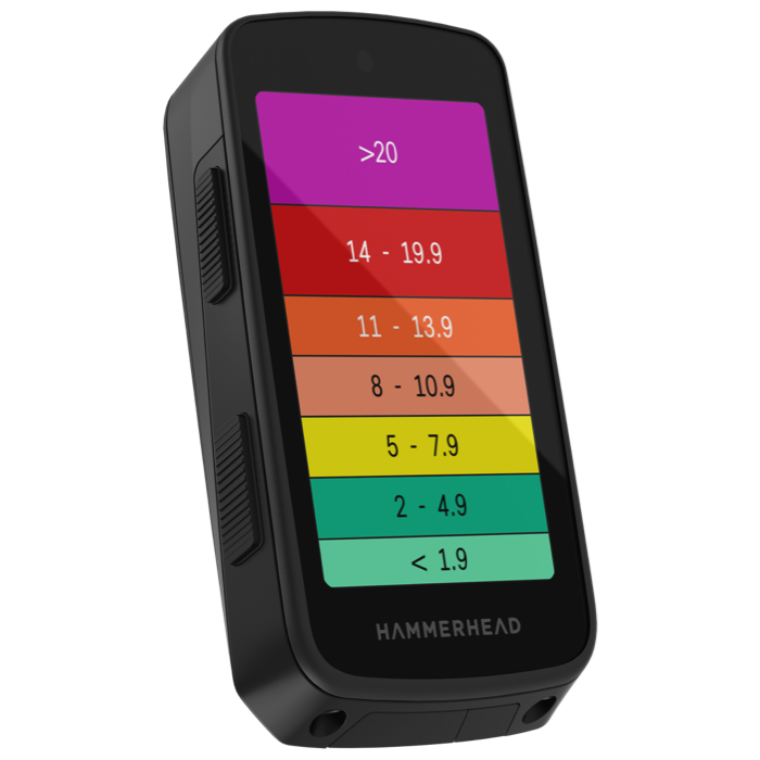
With Hammerhead, yellow is from 7.6-12.5, which is really too wide.
Could you actually configure the colours yourself, I've already got used to Wahoo after several years.

-

I've been working on a Karoo extension called Barberfish that includes a grade data field.
It shows the current grade, slightly smoothed to avoid GPS noise, colored according to a selectable palette. Currently supports Wahoo, Garmin, and Hammerhead styles.It's not the same as the Climber (Karoo Extensions can't modify the Climber widget or add custom tabs), but it does support customizable color banding.
Happy to add community-suggested band breakpoints as a preset.
-

Back to the original request and the wish to improve the colors and grade intervals. It would be great to have some feedback from HH. However, I think that unless we all report this to support, nothing is going to happen. I've already gone this route and their answer wasn't great (I'd translate it to: "we don't care"). Making Climber more usability is just not a great instagram story (as is the questionable route share update, which requires a reasonable user base ...). :-(
-

This is a good point. However, something like this might be a thinkworthy Instagram story, too: "Now you can customise your climber colour as you are used to,.no matter of riding indoors with Zwift or switching over from Garmin or Wahoo. It will look familiar but be better." As it cannot be so complicated, I don't see why they won't just change the default colours as noone recognizes them as intuitive. More than ten percent as yellow is ridiculous.
-

I feel like I was going nearly vertical on Yellow gradient on my MTB today. I love KAROO. The open architecture, coupled with super generous devs, makes the computer a delight. Fixing the Climber Colours is THE major upgrade missing and HH could, if implemented, promote the 'socks' off the feature enhancement. Configurable climber - Unique amongst others in the market #InstaWorthy
-

First of all: I love my Karroo. The display is crisp and clear in all lighting conditions, navigation and rerouting is quick and reliable, battery life is more than sufficient for my needs. A truly perfect device!!!
Almost ….
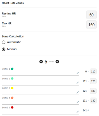
Fixing the climber issue, as mentioned so many times in this forum, shouldn’t be a real problem for people who have created such a great piece of software. I’ve mentioned this over a year ago and want to repeat it again. Customizable gradients in the climber just like the customizable heart rate zones in the settings of Karroo’s dashboard would fix all problems. You could add and delete gradient zones and set your preferences. Some riders, like me, don’t need anything above 13° , others might start climbs at 6 or 7°. And everyone would be satisfied.
If anyone at Hammerhead is reading the comments here, could you please tell us if you are even considering such a modification. It would surely be a great improvement for all Karroo lovers.
Greetings, Klaus
-
Yes, given the much lower activity of HH staff in this forum, I think that sending requests is the only way to make them aware.
I won't mind, if there is a customization option, but I would be happy already if the grade intervals and color would make more sense (no other company has such a terrible implementation as HH, unfortunately). Heart rate / power zones are highly individual per se (i.e., fixed zones do not make sense), grades are different (it's personal preference "only"). Anyway, I'll appreciate any improvement, so that personally I wouldn't for too much in order to get anything at all. But that's just my two cents. :-)
-

Hi everyone,
Thanks for the continued discussion and for being so vocal about this. I wanted to jump in and let you all know that I’ve shared the feedback from this thread directly with our product team. We are definitely watching the forum and doing our best to respond as quickly as possible.
While I don’t have a specific timeline or a final decision to share just yet, please trust that this is something we are actively looking into.
Thanks for your patience and for helping us make the Karoo better! -

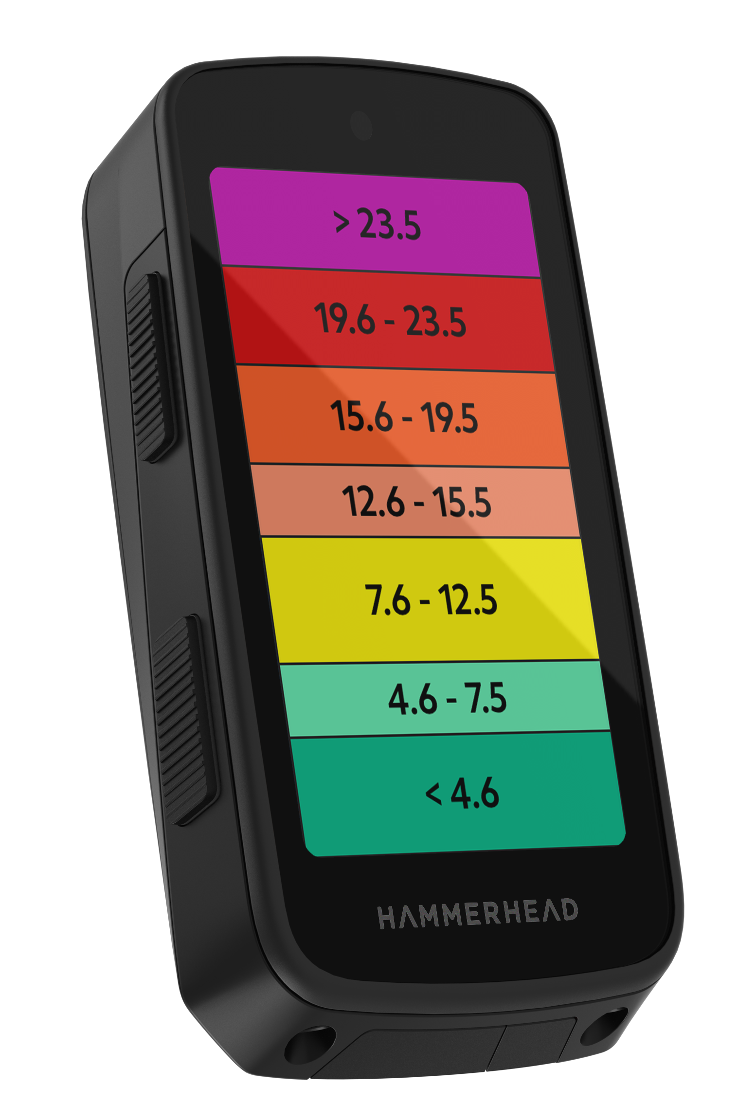
This update is a huge improvement for the climber—something many users have been asking for for a long time. Since Hammerhead simply adjusted the slope ranges for each color, I don’t think the change took the developer very long to implement, so why didn’t you make this obviously necessary change much sooner, Mr. Hammerhead? But anyway, thanks for finally doing it.
-
Thank you HH, this is much appreciated and much better than before. And it's just in time before some climbing this year.
(the minor thing I don't quite catch is the irregularity from 0-1.9 instead of 0-2.9, which would give all 3%-steps until 15%, but it's still much better than before).
-

Why is dark green considered a higher gradient than light green? I think the previous version made more sense, since light green is visually closer to yellow than dark green is.
The current change is quite confusing to me, and I'm struggling to understand the reasoning behind the new color progression.
Hope it is just a bug and they will change the order.
-

Me too, the light color tends to be more on easier side, right?
What I would change is, raise the gradient number +1 for each level of difficulty. So the lowest gradient would be "<2,9". And so on for the rest levels of difficulties. Else, perfect, what we have been asking for, for quite some time.


Please sign in to leave a comment.
Comments
87 comments