Feature Request: "Option to hide the top Status bar"
Good afternoon.
I would like the Hammerhead development team to consider hiding the top status bar: the one that displays data such as time, battery, radar connectivity, Wi-Fi connection, etc.
This information is certainly very useful, but I think it's only useful for checking when needed, not for always having it visible.
The ideal would be to have something like the system on the map page, which allows you to show or hide the fields you have currently displayed with a simple button. Quick and effective... That button to hide the top bar could be placed in the top drop-down menu, in the "screen" menu.
The bar takes up approximately 10% of the screen, which could be used to create more space to display data fields, or even to resize the boxes and add an extra row of fields. I've been looking at images from other devices with a larger screen, and the Garmin 1040/1050 doesn't display it on the route (I don't know if there's an option to hide it), while the Wahoo Ace does, albeit at a much better rate considering its enormous screen size.
Thank you in advance for considering this possibility.
-

Hi Anthony, Thanks for sharing your feedback.
I’ve shared your feedback with our Product Team. Your input is highly valued, as it helps us better understand the improvements riders would like to see. There are many factors that influence product decisions, and not every suggestion can be implemented.We truly appreciate your time and encourage you to continue sharing your insights and suggestions.
-

I actually like the status bar *a lot* (b/c I have time and duration on all pages w/o eating up a lot of space). I understand that different persons have different preferences, but I am fearing a bit (and have said that elsewhere), that Karoo would become a 2nd Garmin with tons of options that you never find. :-)
-

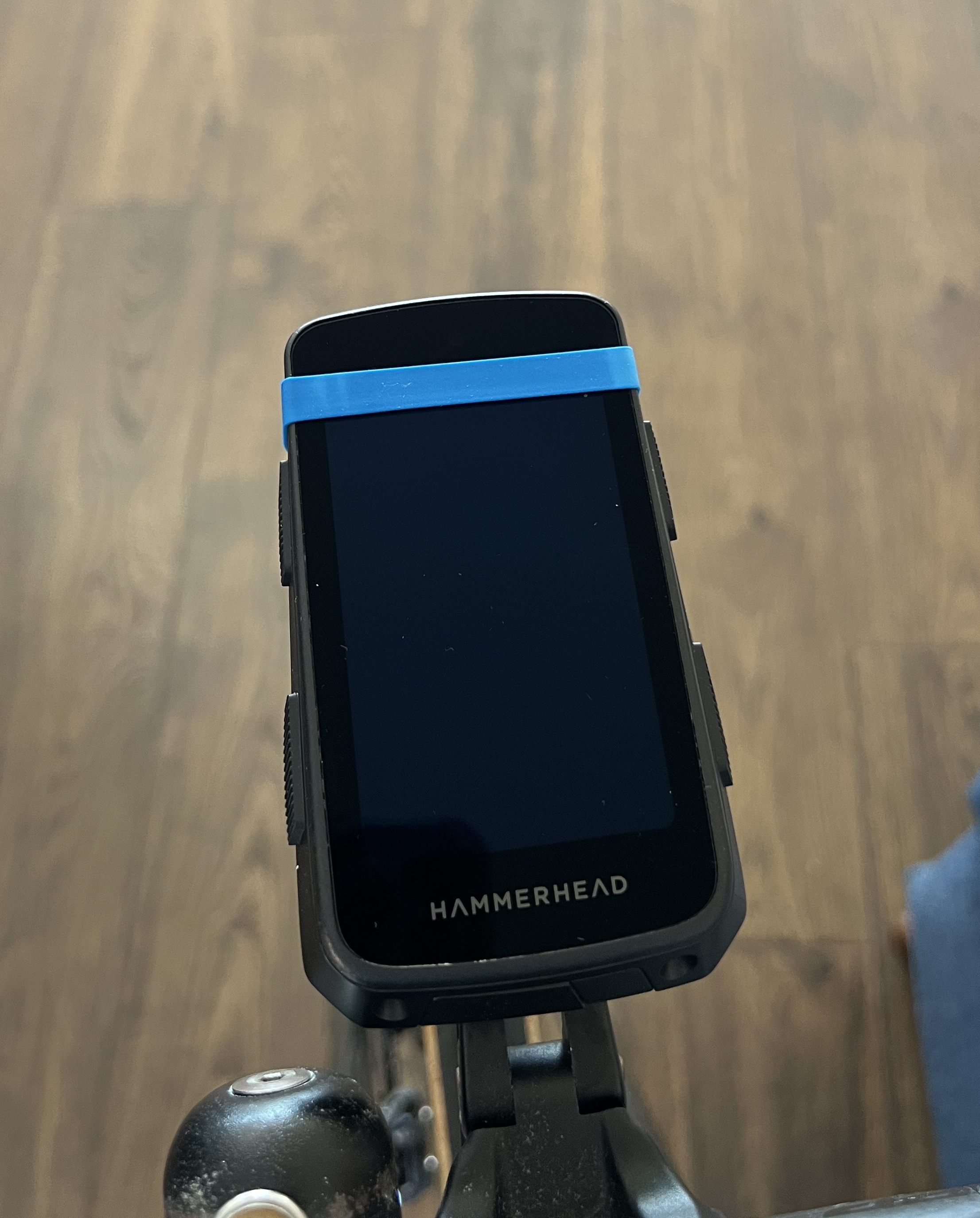
@Anthony, this was my physical solution given the absence of a software solution. I can move the rubber band if I need to but I don't have to look at the time tick by on my ride and I can enjoy just being out there. Otherwise I'm hyper aware of the time passing. It also avoids covering what appears to be a light sensor at the top of the head unit. The ideal would be to allow what shows on the top ribbon or have it hide to allow for more real-estate to be used for other data displays.
-
Honest question: what is so terrible about the status bar (info) that you need to cover it? I had Wahoo and Garmin before w/o the status bar, and **really** appreciated the status bar (which is also on the gen 3 Wahoo devices, not sure about Garmin).
I also understand the request for the option to hide the status bar. It's just that so many feature requests with all sorts of options and customizations have popped in the last couple of weeks and months, that I fear -- if they all would become true -- the Karoo is no more fun to use due to over-optioning it (just like a Garmin, which I deliberately do not buy for this (and other) reasons). Devices like this are a compromise at the end (when you want to maintain usability), so I guess it depends on the design philosophy of the vendor (HH), user requests/acceptance, etc.
-

@Aaron, I just put 2 pieces of black electrical tape to cover the clock and the time elapsed. I like to see my battery level as well as to make sure my Varia is connected.
@Christian, I am not sure of your purpose posting here. No one is asking to get rid of the status bar, just the ability to toggle off the time or elapsed time. That feature is available on every other field area except the status bar. This request is no less valid than any other request. It's clear that not enough people want this change and thus it stays the same.
LIke others, I don't want to see how long I have been riding nor the time. I just want to ride and if I see the time/clock I will then think of how many miles I may have left etc. I never look at my mileage as well. I don't want to know.
-
@Anthony, I was genuinely interested in and curious about the use case. I liked the addition of the status bar and the time (elapsed), probably because I am always time-squeezed and love numbers (so that's just me). So that's my reason for loving it. I like to understand preferences and different opinions. That's all. I am not saying that some option should be there or not. However, I have been following this forum quite some time and there are many requests for new options, which will - at some point - add up and reduce usability. Since you are free to propose new feature, I guess I am free to state that I would like to not have too many options (as with Garmin computers). :-)

Please sign in to leave a comment.
Comments
9 comments