Feature request: Graphical speed field

I've seen this asked for 2 years ago but I will ask again. I've come over from Garmin and had a field that showed current speed and average in one field.
Feels like a waste having 2 fields to see these 2 metrics.
A simple idea would just to add colour to the speed field, like the graphical power field.
So if you are above you average the field is green and below it is red, within 1-2kph it has no colour. Whilst you wouldn't see your actual average it would be enough to gauge if your are slower or faster.
-

You can use this extension to make a single display show two fields:
-
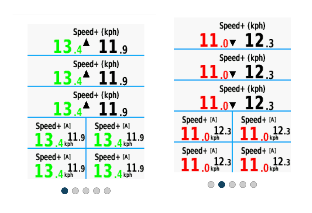
Alpha version. It has three options.
Current speed vs. ride average
Current speed vs. last lap
Current lap speed vs. last lap speed.
-

@david: got the alpha working, here’s a first feedback:
1) I wouldn’t need an arrow
2) pls use the light colours, otherwise the numbers are hard to read
3) I’m not sure if the average is already working as intended. I saw loads of dark green when I started(expected) and a grey/blue? when my pace settled. Yellow almost never and red when I was stopping at a traffic light below 10kmh (ish).
4) red is imho not necessarily the right colour for below average. I’d suggest the light blue. Yellow for the av +- x and green for above.
5) I’d still like to set a desired average and have the colour change based on that setting -
 This is the Garmin field that I was trying to replicate. Green for faster red for slower and no colour (black) when speed is +/- 1kph of average. https://apps.garmin.com/apps/798807e6-9b83-4f3c-b85b-1237e9150ccc?tid=0
 -
My goal was to stick with the design this of the Karoo. I'm not aware of any other display that uses colored numbers and no background. I could possibly add the arrow but I'd like to get the rest of the functionality sorted. It would be best to open feature requests on the GitHub to track all this. Especially since one person wants arrows and colors, one person doesn't need an arrow, and another wants no colors but colored numbers :)
-
I agree David. Hence when I first put in the suggestion it was to replicate the Garmin field but in the Karoo design language in my mock up. Green background for faster, red background for slower and no background for +\- 1kph of average speed. Personally would like arrows as I think it helps but it’s not a deal breaker and could be a setting. I do however strongly believe that green should be for higher and red lower as this is a universal design language. Thanks for your efforts with this. Unfortunately I’m not a coder or I’d just do it myself but as a graphic designer I have strong ilfeelings in what it should look like.
-

David, I was referring to the mock-up provided by Jamie. In general, I like all of the suggestions, it's just that I already use power and heart rate with background. That being said, I'd feel that a colored background would suit these data fields, but then it would look similar (Too much colored fields for me ;-). The colored numbers are fine, but I'm not sure about readability. Personally, I'd favor a small indicator (arrows, dot), but that is just my use case, and for others it may be completely different.
-
I’ve uploaded a new alpha release that I think answers all the issues and adds a couple features. It’s not marked as latest yet since I haven’t tested it much. But let me know what you think.
https://github.com/currand/karoo-colorspeed/releases/tag/v0.3.0-alpha
Please sign in to leave a comment.
Comments
14 comments