Climber - improved screen partitioning...

Climber tab covers lower half of map-type screens (full-screen map OR map+data fields), thereby hiding both navigation arrow (direction) and the to-come-next piece of the track which is very important to e.g. NOT miss the next turn. Only solution for me so far is to swipe-toggle up/down Climber tab in order to reveal the arrow and track for orientation again... :-(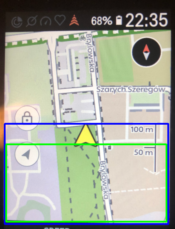
BLUE area: current screen canvas for Climber in map view
GREEN area: suggested screen canvas for Climber - thereby NOT overlaying arrow and near-range track line so the user can still see what is coming up next
-

It gets even crazier when you have datafields enabled, when you have two lines of datafields you have around 2 pixels height worth of map.
From a UX design perspective this is absolutely ridiculous (like many other things in the Karoo UI), the system should be reworked completely. Its a nice idea with the swiping up and stuff, but its just not working out. Having seperate pages for climber for instance would be far better.
-

Climber should be a Drawer we can add to each Layout if we wish. Keep it as a drawer but allow the user to define which Layouts it appears on.
By implementing Drawers for Layouts, you are creating a better user interface in the long run and also making implementing new Karoo developments easier. -
Climber should be a Drawer we can add to each Layout if we wish. Keep it as a drawer but allow the user to define which Layouts it appears on.
By implementing Drawers for Layouts, you are creating a better user interface in the long run and also making implementing new Karoo developments easier.No.


Please sign in to leave a comment.
Comments
9 comments