Feature request: map mode improvements

Background: over the past few months I have used my Karoo 2 for navigating through about 1500 km of unfamiliar roads (plus several times that on roads that I know by heart, even including the smells, in such cases maybe half the time with a route active and the other half without). Overall I’m extremely happy, ad hoc reroutes worked fine, and I only made a total of maybe 5 wrong turns which I noticed more or less right away. That being said, of course there is always room for improvement.
Map data especially concerning bike infrastructure is inconsistent enough (e.g. following a bike path right next to a road going straight across an intersection could result in anything from 0 to 4 turns in a row; this kind of stuff is also what caused pretty much all the wrong turns) that I would not dream of using navigation without a map.
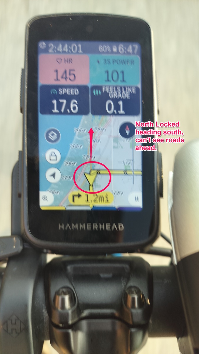
I normally use the map view with either 2 or 4 data fields depending on if the bike has a power meter, map with north-is-up orientation, usually zoom level where the scale shows 1 km as either step. Now that I realized that that was an option, I have recently switched to the variant where the data fields are at the bottom of the screen which helps with the first two of these.
In no particular order:
- center map properly in the visible area: current position can now be obscured by navigation cues, also currently it looks like the position at the bottom quarter of the screen which I guess makes sense if your map keeps turning but is annoying with north-is-up, especially when heading in a southerly direction
- make dismissing the red cues by swiping down persistent: trying use the map to figure out where I can go (because of road works or whatever) gets annoying when half of it is covered by a box saying Rerouting... which reappears seconds after swiping it down
- adaptive zoom level option depending on distance to next turn: generally I like to view a bigger area, but sometimes it is not possible to make sense of the route without looking very closely at the road layout, so it would be nice if this happened automatically when getting to a turn and then went back to normal afterwards (these kinds of situations generally require using one hand to signal turns so pressing buttons isn’t that easy...)
- show navigation cues earlier depending on current speed: current state is mostly okay, but I would like to see them a bit sooner especially at 50 km/h or above
- make some navigation icons clearer, especially the T junction turns (with a dot for the other direction) are a bit difficult to parse for my middle-aged eyes
- after creating a diversion route by selecting a point on the map, return map to locked state (maybe after a short delay) to make current position visible again
- configurable defaults for map orientation, zoom level, 3D, what else (wrote a separate request about this earlier)
- in list of routes, route reload button (or pull down from top) for refreshing the routes from external services: I generally use Komoot for route planning and every now and then have to get my phone just to press the reload button on the website
- allow for more than one map screen in each profile
- why does the map-only layout have a big black bar at the top so that the visible map area is only marginally bigger than with two data fields?
I guess there might be more of these but these were the most obvious ones to me. Anyway, overall still extremely happy with the product.
-

Too bad this post is 4 years old and not much community traction. Though some of your suggestions have been incorporated.
I came to post about the Map Centering issue.
@karoo When riding without navigation enabled and map oriented in fixed North mode, the user cursor indictor could move to the side opposite of travel so that the maximum amount of map ahead is available for viewing. Orienting the user arrow is probably a hard thing to do, but it would be very useful!
-
Yeah, a few of these (turn icons, route refresh, map-only screen) have been addressed, and the auto map mode gives something of an auto zoom before turn but the area shown is generally too small for my preferences and adjusting it messes up the normal zoom level (and possibly the auto map sometimes does this on its own as well). Meanwhile, using north-up orientation has become even worse even that there is no reliable indication of current state except when moving (and not heading north).
These seem to me like fairly low-effort changes with significant quality-of-life improvements at least for my particular use case, so I am rather disappointed that not more progress has been made with the map features.
Oh, and I would add few more to the list:
- Making the map scale indicator clearer. The numbers are so tiny I (as a near-sighted person) can only make sense of them by lifting my glasses and looking closely. I’m not sure bigger digits are necessarily a good solution, maybe a colour-coded something (either the scale line itself or just a little blob) would work?
- POI blobs should not be shown in front of the route line. In some conditions, the blob obscures where you are supposed to go, and if you have a number of permanent POIs on your map, you can no longer zoom out to view the entire route without most or even all of it ending up behind the POIs.
Please sign in to leave a comment.
Comments
2 comments