Barberfish extension
Hey Karoo community
I've been building a Karoo extension called Barberfish and just released v1.0.
It reimplements and enhances a core set of data fields
What it adds:
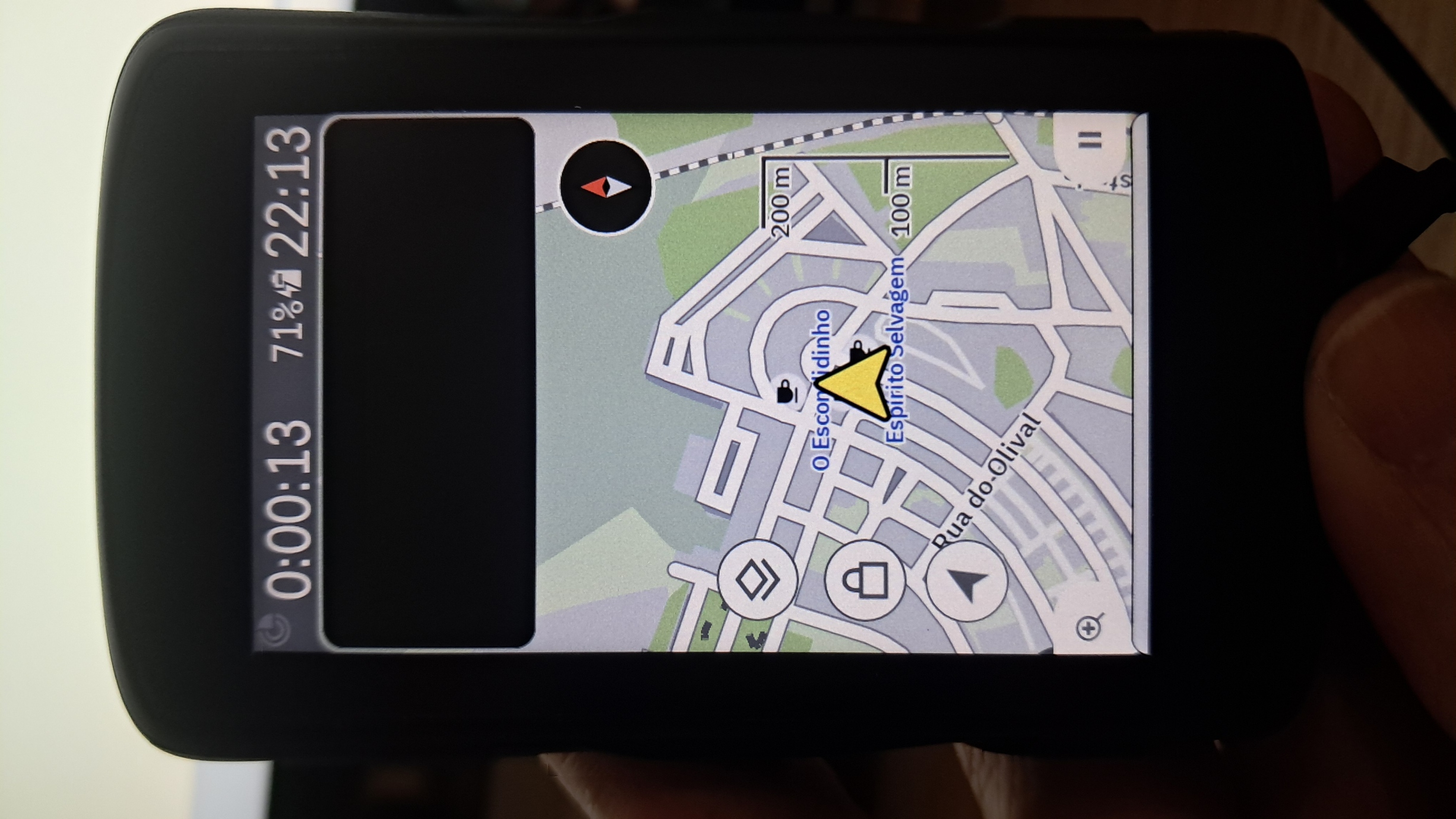
* 3-column HUD — speed, heart rate, and power side by side in a single row, designed as the top row of a map page
* Zone coloring — background fill or text color, with four palettes: Hammerhead, Wahoo, Zwift, and Intervals.icu
* Average speed with threshold coloring — set a single target pace (goes green/red) or a min/max range (great for ACP randonneuring or paced events)
* Better time formatting — unambiguous across all durations: 1h 23'45", 1:23:45, or 1h 23m 45s
Everything is configurable from the Barberfish app on the Karoo itself, changes update live.
Installation: sideload the APK from the latest release following Hammerhead's standard sideloading instructions.
Full README with screenshots, palette previews, and use cases:
https://github.com/jpweytjens/barberfish
-

Barberfish v2.0 is out!
What's new:
- Configurable HUD slots
each column is now independently selectable. - Four-column HUD
an optional 4th column - New data fields
cadence (instant, 3 s, 5 s, 10 s),
average aower,
normalized power (NP),
grade. Grade uses EWMA smoothing (~6 s time constant) to filter out GPS noise. - Grade coloring
gradient palette with Wahoo, Garmin, and Hammerhead styles to choose from. - Rendering overhaul
should look even more at home alongside the native fields now.
- Configurable HUD slots
-

This looks fab.👍🏼. Just what KAROO needs. I'll be downloading today and trialling this week. Integration with KAROO looks particularly nice. Random question but can the fields be also semi-transparent, with contrasting font as sometimes it's nice to see map a little underneath (easy on the eyes is key though). Thank you meantime. Works well will Route graph it seems. Zwift metrics/colouring also look nice. Feedback to follow 😁
-
Fully understood. Thanks for answering. I have downloaded the APK and in the process of configuration. Looks great. Any chance the climb grade colours could also match Zwift please (akin to Power and HRM options already in drop-down menus). Zwift Gradient Colours:
📈 Climbs (positive gradient)
- 0% to +3% → Green
- +3% to +6% → Yellow
- +6% to +9% → Orange
- +9% and above → Red📉 Descents (negative gradient)
- 0% to –3% → Light Blue
- –3% to –6% → Blue
- –6% and steeper → Dark BlueI feel this feature will be increasingly requested as Zwift has just announced greater links between indoor and outdoor rides/workouts in the future. Thanks again.
-
Great suggestion everyone, thank you. I'll add the Zwift gradient color palette. Do you have a reference with the exact colours by any chance?
I'm hoping to release a v3.0 soon with a new features and some fixes. The main new features all focus around the grade data field, grade coloring and the excess vertical space in the HUD. -
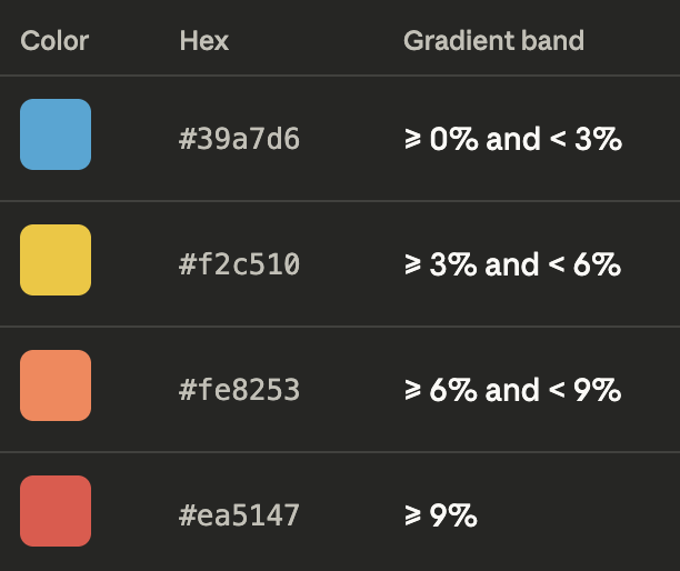
Hi Johannes, I asked AI and it came back with the following Zwift Gradient colours (cannot find official colours):
- ≤ 0% — #4DA6FF — Blue (descent / flat)
- 1–3% — #00CC66 — Green (mild climb)
- 4–6% — #FFCC00 — Yellow (moderate climb)
- 7–9% — #FF7F00 — Orange (hard climb)
- ≥ 10% — #FF1A1A — Red (steep climb)These five colours are the core anchor colours, but Zwift actually uses a continuous gradient ramp between them. In practice, the game interpolates smoothly from blue → green → yellow → orange → red, so you see many intermediate shades.
But in terms of distinct, intentional colour stops, Zwift only uses these five for accents.
For descents, Zwift actually uses two descent colours, depending on how negative the gradient is. They’re both in the blue family, but with different saturation levels.
- 0% to –3% — #4DA6FF — Light blue (gentle descent)
- ≤ –4% — #3399FF — Deeper blue (stronger descent)Those two tones cover everything Zwift uses for downhill gradients. All other shades you see are just the engine blending between them.
Hope this helps
-

It's fantastic, congratulations on the HUD!
I use Karoo2 and the new Karoo (Karoo3). Everything is ok in Karoo3, but unfortunately in Karoo2 I don't have visibility of the data on the map.
I also wish the cadence had the option to display color; for those who have to work based on cadence, that would be perfect, and the functional cadence value could be set in the configurator.
It would be great to reduce the vertical size of the HUD, but that's a different setting, as it would allow for better visibility on the map.
I will continue to follow the development and leave my feedback here.
-

Hello.
Yesterday I was testing it with the 4-field HUD, including the average speed data in one of the fields. The data in that field remained blank during the ride. :(
Will you be releasing version 3 soon to fix these bugs? It would also be great to have one or two more HUDs that could be displayed on the same page.
By the way, the extension is excellent and very useful.
Thanks.
-
Hey Paulo and Javiuchi, I just released v3.0. The average speed data has been fixed, and Barberfish now fully supports Karoo 2 as well.
There part of a whole host of new features including the colored cadence data field:
### Elevation sparkline
A tiny mountain profile now lives below your HUD.
Only when a route is loaded, you see the past on the left, current gradient in the middle, upcoming elevation on the right. Tap to look 5, 10, or 20 km ahead.
### New data fields
The field list was starting to feel like it only cared about your current moment. Now it also cares about your recent and average moments.
- (Last) Lap Power
- (Last) Lap Time
- (Last) Lap HR
- Average HR
- Cadence threshold coloring — set a target RPM or min/max zone, same system as average speed### ETA
Three new ETA data fields
- Remaining ride time (excluding paused time)
- Time to destination (including paused time)
- Clock-on-the-wall arrival time.### Elapsed/paused time fix
Somebody at Karoo named the moving-time field `ELAPSED_TIME` and the total-time field `RIDE_TIME` and I got confused.
- Fixed elapsed time showing no values
- Fixed paused time showing large values### Zone colors
Tweaked color palettes for increased readability in dark mode.
- APCA contrast tuning and HSLuv lightness correction per palette
- New HSLuv palette designed for readability in dark mode
- Zwift grade palette for indoor climb sessions### Compatibility
- Light mode support
- Karoo 2 support### Config screen
- Config UI has more organisation and new UI to follow Karoo UI more closely.
-
Thank you very much.
I was looking at it yesterday and I think it's a great improvement, although I haven't been able to test it on the road yet.
The upcoming elevation change line on the HUD seems like a fantastic feature, but I think everything is too crammed into a single row.
To resolve this, I think there could be two solutions:
1) Enable the option to show only the icons for the data fields and not the text, so that there's more space for the data.
2) Give the option to display the data fields and the elevation change line on two lines, sizing the displayed data to the maximum height and width of the box.
Thanks again!
-
Hello Johannes
It's fantastic! You've achieved something many others haven't yet considered, that is the importance of having visible some important information.
And yes working in Karoo2.
For example, I use a "Climber" profile where I only have the map, and I always had cadence and heart rate data. After acquiring the powermeter, the problem was having everything condensed into a single line that allowed me to see the map and the desired information, without need to touch in screen, nothing more.
With your excellent work, it's possible to visualize everything.
I haven't had the opportunity to test it yet, but I'll give feedback as soon as I can.
What I would change: Perhaps i would reduce the size of the numbers (font size) on data a little bit more and make them bold.
Javiuchi's idea is also seems like a great option.
Otherwise, it's excellent.
Congratulations, let's continue following the progress.
-
Hey Javiuchi,
Interesting comments, as I've tried best my to maximize readability (at a glance) given the limited space. Compare e.g. the height of a single row on the map page (https://github.com/jpweytjens/Barberfish/blob/master/docs/hud_four_zones.jpg) vs a double row layout (https://github.com/jpweytjens/Barberfish/blob/master/docs/hud_fill.jpg).
The height is set by Karoo and can't be altered via the SDK. The idea behind the HUD is adding it as a single row on the map page. This gives me control over the full height, and how much is used for the values and how much for the sparkline. E.g., the values move up when a sparkline is enabled. This could potentially be tweaked a bit more.
With regards to the label text, the main limiting factor for increasing the font size is the width, especially in 4 column layout, not the height. The font sizes are set to the largest value that can display a 4 digit number in the 3 column layout (e.g. 1234 W) and a 3 digit number in 4 column layout. More digits will shrink the font to fit the available width.
Any ideas on how to improve are welcome given these constraints.
-
Dear Paulo,
thanks for the comment. The font is bold on Karoo 3 but not on Karoo 2. I'm still looking into this. The method I use to make it bold on Karoo 3 is not available on the older Android version that runs on Karoo 2. As the native Karoo 2 values are bold, I'm sure there's a method out there.
-

Hi Johannes,
Thanks for the great extension.
I found a small bug in the gui.
when navigating datafields are getting cutoff on my karoo 2 (barberfish release 3.0)
Everything is fine we there is no navigation active (no next corner toaster at the bottom).
Any plans on adding a second row option to HUB for 6 or 8 datafields?
Thanks again!
-

Great work, Johannes—the extension is fantastic.
In my case, I haven't quite found a color gradient palette that's completely perfect.
Have you considered creating a mixed palette combining colors and hues from the ones you have? For example, the Karoo colors but with the HSLuv hue range.
Why doesn’t HSLuv satisfy me visually? Mentally, I don’t perceive 9% as “green.” But at the same gradient, the Karoo Readable palette fits much better.
Thanks for your effort.
-
Hey Sasker.
Great question. Looking at the discussion about the climber colours elsewhere on this forum, I'm not sure there's a one size fits all solution.
I was thinking of adding the Turbo colormap. That provides a HSLuv like progression from green to red for positive gradients, but could also add a green to blue progression for descents.The 3% gradient steps feel like the right size. With the Turbo example, 0 to 3 would be green, 3 to 6 would be yellowish, 6 to 9 orangish. The other side would be tealish for -3 to 0, light blue for -6 to -3, ...
Does that more closely align with how you perceive the gradients? -
I've been looking at the Turbo colormap, and it seems like a great way to understand the relative effort based on the gradient.
The squares along the center line of the image would perfectly convey the sensation of going uphill (toward red) or downhill (toward blue).
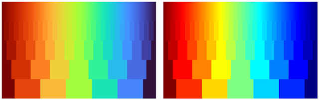
And I totally agree—3% increments seem to be the best fit for everyone.
Thank you for your response and for your effort.
-
Hey Jorik, thanks for raising the issue. I just released version 3.2 which fixes the clipping issue. I thought it would be an easy fix, but it required quite some rethinking of how Barberfish displays the values. I'll think about adding the 2nd row.
The Turbo color palette is now also available for displaying the grades in both the grade datafield and the sparkline.
The release and full changelogs can be found here: https://github.com/jpweytjens/Barberfish/releases/tag/3.2
-
Hey Marc, version 3.3 added 5 new datafields including percentage of maximum heart rate alongside other improvements. You can find the full changelog here: https://github.com/jpweytjens/Barberfish/releases/tag/3.3.
Hey Alberto, the sparkline needs a route to be loaded for it to show. Are you using a route? If so, please open an issue on the github repo with more details: https://github.com/jpweytjens/Barberfish/issues.
-

Awesome Extension. Just downloaded it on my Karoo 3 with the latest versions.
Sadly the Grade Datafield is still clipping on my Device...
Is there a way to add an option to disable the icons on the data field from barberfish? the data fields from the extensions are always showing the icons but in my case I have disabled the global ones from Karoo and now its a mix of visible and invisible icons.
Thank you for your great work Johannes!
-
Hey Basti,
I can't reproduce the clipping grade datafield on a Karoo 3, running Barberish v3.3 on the latest Karoo OS. Could you provide more details in this Github issue please? Things like Karoo version, barberfish version and a screenshot would be helpful.
https://github.com/jpweytjens/Barberfish/issues/6
I'll have a look at the datafield icons. I don't think the SDK allows developers to detect this settings, but Barberfish could mimick the datafield design settings of Karoo OS.


Please sign in to leave a comment.
Comments
33 comments