Strava Segment View Layout on Karoo2 Review and Suggestion
Hi All,
To whoever reads this post thank you in advance.
I am a recent adopter of the Karoo2. I have used Wahoo products for years and up till now used a Wahoo ROAM and had no problem with it. I purchased a Karoo2 to play with it and see if I liked it.
Overall I like the Karoo2 and 90% of the features and usability. The 10% I am struggling with though is in an area that is most important to me, Strava Segments and readability of data on the screen. In general, for me, Hammerhead has and continues to miss the boat on this feature set completely. Readability and useful data are a miss for me and many others as I read the multitude of posts on this topic.
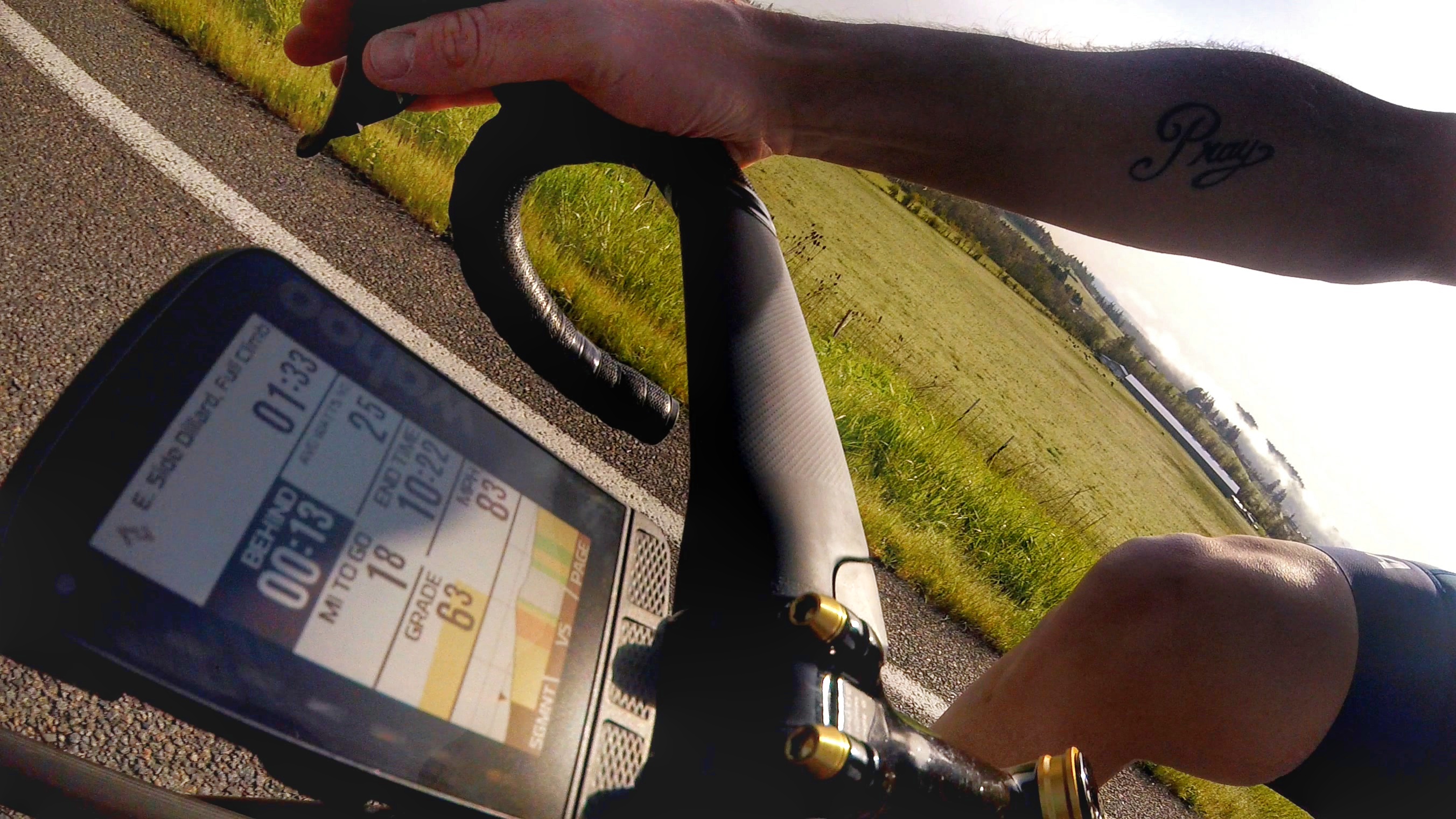
I know that being different than the competition's product(s) is always a goal. And to that end, I agree and think Hammerhead has done a masterful job in all other areas, but this one. I want useful data in a readable format like the Wahoo product. I don't want/need a carrot and a crown that I can hardly see on the screen anyway. I want/need bolder font and data fields like the ROAM photo I have inserted.
I will continue to use the Karoo2 and hope that updates come and this area is, honestly, revamped and I mean all of it. If in the end, Hammerhead keeps it much the same, that will force me back to the competition's product.
Thank you, Hammerhead for moving the industry forward and releasing a very good product. You have forced your competitors to make changes to their products, but now you have to stay in front of that to grow yours. ( yes professionally I am in sales and marketing :-) )
Tim
-

Probably a change for the next version of the Karoo as it will require a hardware update to the screen. Wahoo's e-ink display and font offers a clarity and readability the K2 struggles to come close to. Similar to expecting a TN tv panel to display the same black depth as OLED. I wouldn't want the next Karoo to have OLED though due to static data fields and burn-in which would make it worse to read in the long-term.
With my eyesight I had hoped the increased size of the K2 (my previous was an Edge 520) would make readability significantly easier but the map screen and profile graph is still a struggle and the Climber gradients scrolling along the bottom are more or less invisible to me. The font size on anything more than 4 data fields has me staring at the screen longer than I feel safe to do so. -

Even though I agree a transreflective display like wahoo and garmin is superior in terms of visibility in sunlight, I think a lot can be done to improve readability on the Karoo. Icons and Fonts are very tiny everywhere and the Fonts used are way too thin to be easily glanceable while moving. I have already created a post about this here: https://support.hammerhead.io/hc/en-us/community/posts/1260803144990-Use-the-Space-How-it-is-vs-how-it-could-be-?page=1#community_comment_6833022691227
Note the newest update all the way at the bottom.
-

I have to disagree somewhat. I recently bought the bolt v2 for comparison and thought exactly the opposite. Wahoo has the time on the segment in big font at the top, which I don't need at all. On the K2 I see my preferred fields at the top (like Power, HR) and see where I am at at the bottom. Surely, a dedicated Strava page would be great (graph + configurable fields). The only noteworthy difference is the "behind" data field, but I can clear see if I am in front on the K2.
Data fields for strava like "behind/in front" or avg power on segment would be great additions on the K2.
Other downsides on Wahoo: You don't see vs KOM and vs PR at the same time and when multiple segments are active, the design is better on the K2 imo (although not ideal as well to switch when doing a big effort).
In terms of readability of the screen: When no screen protector is applied, I find the K2 great in all conditions. Surely in very bright sunny conditions, the bolt is great but literally in all other conditions (shade, woods, cloudy, evening, early mornings) the K2 is better. I cerainly wouldn't want to trade screens :)
Please sign in to leave a comment.
Comments
4 comments