Little UI glitches
AnsweredHi,
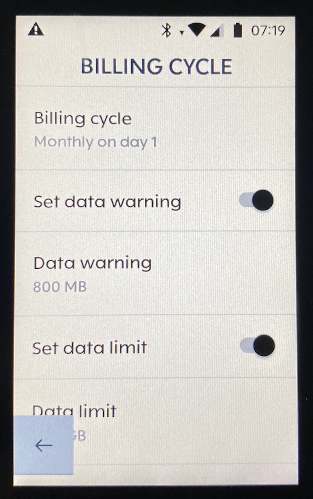
in the Billing Cylce screen - opposed to other screens - you are not able to scroll the list up to reveal the value that is hidden in the lower left corner behind the arrow. (I know you can hide the arrow, but in other screens you are usually able to just scroll the view a little bit up to see hidden text.)
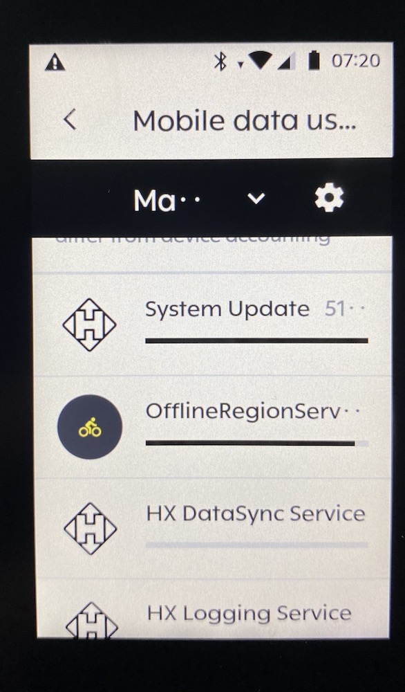
And under Mobile Data Usage more or less every month is abbreviated, although there is actually enough space.
Thanks
Marco
-

Another screen that I think could use some love is the search of routes.
You can usually only see one hit. The sorting icon is very unattractive lying over the list. If there was a way to close the keyboard, that would be very helpful.
Another thing that does not work for me is deleting the search entry with the "X" in the upper right corner. Unfortunately, nothing happens when you press it. You have to delete the text entry with "Backspace" on the keyboard to be able to enter something else.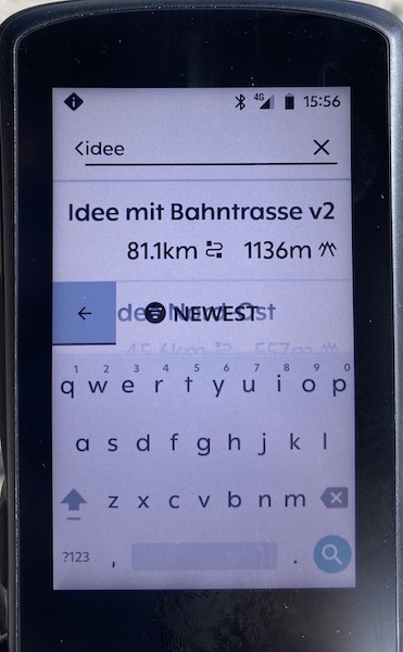
-

We are aware of this UI inconsistency in the list view of the Routes and we are planning to improve. You can close the keyboard by tapping on the back arrow on the left side of the screen.
We have fixed the issue with the broken "X" icon in the upper right corner in our recent release.

Please sign in to leave a comment.
Comments
3 comments