Do you like the new "in-ride look"?
I always try to be positive about new user interfaces. I always try to recognize the advantages of new UIs. In my previous job I designed a lot of UIs.
But this new updated UI does not work for me. The legacy UI was a very good looking UI (It had some roughness, but was a nice, modern UI). The new rounded corner boxes are pointless, the grey background color is ugly, and not harmonic. The legacy UI was much more modern this new UI is just old fashioned and outdated. The large upcoming elevation graph black background on a black screen looked very good, the new grey graph is just ugly. The legacy UI gave higher contrast feeling, the new grey color brings low contrast feeling.
My suggestions for Hammerhead are rethink and tweak this new UI and/or make an option to use the legacy UI (my main buying decision to Karoo was the good looking UI). The best would be it you keep the style of the legacy UI and make small updates and error corrections on it. It the new boxes layout is a must have (for future functions), you have a much more better way to design a boxed layout.
Please review this new UI!
What do you think?
-

When I bought the Karoo 2, the old presentation almost made me send it back immediately because the information was so unreadable at a glance. I told myself it would be so much better with separators between the data fields. I don't care about if it's less pretty or class or I don't know what, all I want from my cycling computer is being able to read the info I need quickly when I need it. And it's definitely way better with the new UI.
Even though, an accessibility setting to get the font bigger (even if it means less data fields) could be a good idea for people with poor eyesight. But not take this as the general, most people don't have vision problems or correct them with contact lenses or sunglasses...
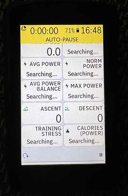
And besides that there is few things that could easily be better. Like this space at the bottom between the "Lap" and "Pause" Logo, it is so much waste. This space isn't used while the "Auto-pause" hide some data fields...
-

I was holding off running the update after seeing the example screen layouts provided by HH and reading all the negative feedback. I decided not updating wasn't an option, long term - plus I wanted to see what it looks like for myself, so I took a deep breath and ran the update.
I gotta say I kinda like it, and I'm looking forward to what HH does next with the UI... with one big exception. I really dislike the new data labels. I especially dislike the change to two lines. I'm baffled why HH doesn't think I know what "3s Pwr" means and had to change it to "3s AVG POWER"??
Same for "Lap Pwr" vs "LAP AVG POWER", etc.
All it would take to get me 100% onboard with the new UI is to go back to the old 1 line abbreviations, change to lower case (instead of shouting in all caps) and maybe subdue the font color a little bit.
I don't have a problem with the data font size but it would be a bonus if HH reduced the label's font size a little.
Thanks - I take back all my earlier criticisms.
-

Rode it again today and still loathe it.
It’s a total mess. Typography is ill-sized, not centred, text is too big, space is wasted.
It’s off the bike until this is sorted.
I’m also struggling to see when I’d want to take my eyes off the road long enough to start moving tiles. Once I set a computer up it’s pretty much set. I know where my data fields are and my eye can naturally fall to where I need to look.
Until someone guts the UI that is.
-

Went for a 2 hour ride with the new UI this morning, and confirmed that I do not appreciate the reduced font size and the expanded data labels. Much harder to make out numbers at a glance which is the point of having a head unit on the handlebars, otherwise I'd just use a sports watch.
-

If these tiles ultimately become repositionable, in particular on the map view, like the app icons on my iPhone, Karoo might be into something big
... but you can already move the data fields about on the K2, and every other high end cycle computer. If you mean being able to drag them mobile-phone style with your finger is going to be some sort of game changer, its pretty far down my priority list in terms of the developments I would have hoped for
-

As a devoted Karoo 2 user, I have loved every update excepting this change. The UI is a massive step backwards and looks absolutely terrible. Titles for each metric are too large and the boxing of information has shrank the interface drastically. I know there was empty space prior to the UI update, but the addition of greys between the displayed information is absolutely atrocious.
-

Strong dislike of the new display design. For readability and aesthetic reasons.
The new fields are less readable. The border between the data and the edge of the squircle is very fine, so the text runs almost hard up against the new grey gutters between. This looks terrible and makes the data more difficult to read.
Overall the array of tiles feels very generic, and entirely unlike the clean and uncluttered interface that drew me to the Hammerhead in the first place.
-

Hi, I don't like the change... I can understand the boxes... but not in that way. The user Kristóf Szabó did a great draft, minimising the wasted pixels and returning back the big font size. The main thing in my opinion is the digits size... as said by almost everyone. Also, the text I think it's good to have, but it is less important, it can be in minor size, or even disappear if a user want to, and have only an icon.
Other thing that is remarkable, is the "next turn", I liked it appear without the cues, occupying a little space for a moment... but now, it has reserved a lot of pixels, I think, in order not to block data at any moment. I have the map page with 2x2 data boxes, and with this thing, the map is reduced even more. The map looked divided in 2 parts, the new below arrow part, is not important at all, what you want to see, are the next movements, junctions, etc. As workaround I had to disable the "next turn" and able the "cues", I don't like it, but it is better than the new feature.
I hope HH team solve quickly the matter of digits size in next updates. Maybe in the future, HH wants to do something more with the boxes, maybe more customisable, and so we have now the first version of boxes... ok, good, but the most important things like big and clear font size hasn't be lost... new features could be welcomed without losing the originals.
Thanks for reading. Regards.
-

I updated today. It's OKish for 4 full width fields. Terrible for 8 fields. Two rows for labels? What a terrible design decision. I'm reminded of a friend joking about a local road named "Dr Martin Luther King Jr. Blvd." He thought it should be "Doctor Martin Luthor King Junior Boulevard" because he wanted a 20 foot long sign on the traffic light. That's what we got. POWER is spelled out but HR isn't. BALANCE is spelled out but AVG isn't. Be consistent guys - use 3 lines so you can spell EVERYTHING out. Having TRAINING STRESS (missing SCORE, guys!) is such a big improvement over TSS. INTENSITY FACTOR is so much better than IF. It's not like I was the person who layed out the data fields and so might have some a priori idea what the fields might be. You probably did an analysis and concluded given the age of your users that the incidence of dementia is quite high and we might need constant and spelled out reminders of what each field is.
Seriously, please make the previous version available. This is annoying.
-

I am soooooooooo happy with the new UI update. WOW!!!! Much easier to read. Finally something good became great! Even with a few flaws it's nothing fatal. This is a step in the right direction for UI development and modernization. Flat material like design similar to what Google is doing. Kudos to the team on a first step. It will only get better
-

Ouf this might lead into exchanging the device for my 2nd best bike computer option (wahoo) if HH wont get this straight again. I do think such a huge amount of comments should be proof enough for a required roll back… I also dont like the standard replies like „we are always trying to improve things long-term“ - sure you get used to everything and we have seen this in different situations where huge UI improvements caused a scream but sorry, this seems to me a not very well thought through change… And I even have not updated the device. Just the screenshots look horrible!
-

@LeeADorney,
I appreciate your point of view. Could you clarify your intentions behind these posts? We can all relate to the frustration and disappointment caused by the company's lack of timely and personalized replies.I would like to encourage Hammerhead to actively listen to its customers and prioritize open communication, transparency, and responsiveness. By doing so, they can work towards meeting customer expectations and demonstrate that they value the thoughts and contributions of their loyal supporters. Taking customer feedback into consideration can lead to significant improvements and foster a stronger relationship with the community.
Let's remember that "Taking customer feedback into consideration" is a crucial aspect. While we may not know the exact development path the company is pursuing in the long run, ultimately, our influence is limited. This applies not only to Hammerhead but also to Garmin and Wahoo or Apple.
I kindly request you to refrain from constant agitation and instead focus on fostering a productive and polite conversation. Let's strive to contribute positively to the forum and work towards bettering our cycling experiences together.
-

I agree with Kristófs criticism and much prefer the look of his proposed UI!
I consider myself a Karoo2 fan. I love this thing, I enjoy using it, I love interacting with it. The new in ride look has completely destroyed the experience for me, just because its ugly and less functional. Incredibly disappointing!
-

I completely agree with Kristóf. When a company like Hammerhead pushes a new UI I’m always very enthusiastic about it, I like changes like this when they are for the better. However, in this case, I share the disappointment with the updated UI.
The previous legacy UI was undoubtedly appealing, featuring a nice, modern design. The new rounded corner boxes seem to lack purpose and contribute to an overall lackluster appearance. The grey background color chosen for the new UI is unattractive and lacks harmony. In comparison, the legacy UI exuded a more modern vibe, while the new UI feels old-fashioned and outdated. Furthermore, the new grey color creates a low contrast feeling, in contrast to the higher contrast feeling achieved by the legacy UI.
I agree with the suggestions for Hammerhead. It would be great if they listen to their fans and reconsider and fine-tune the new UI, or provide an option to revert to the legacy UI. Personally, the appealing UI was a significant factor in my decision to choose Karoo. Ideally, Hammerhead could maintain the style of the legacy UI while making small updates and error corrections. If the new boxed layout is deemed necessary for future functions, there are certainly more effective and visually pleasing ways to design it.
I strongly support the call for a review of the new UI. It is essential for Hammerhead to address the concerns raised and work towards a UI that not only functions well but also captivates users with its aesthetic appeal. Until now that was the strength of Hammerhead.
-

Not sure if it'll count for much, I also preferred the previous UI - in the era of clean, aesthetically pleasing OS, this design is quite perplexing. I'm hopeful that a larger plan is at work here but a bit concerned that this revolves around a new Karoo (version 3) and we'll be 'stuck' with this UI on our K2s - not something I would have given any thought to if they hadn't just dropped a massive sale of the unit.
I'm not sure if the K2 has enough power or ability to change the 'skin' - I'm not a designer or have any experience with that sort of thing so I'd defer to many others on here but, if that's a possibility, the ability to revert or change the skin to the previous UI would be great. HH would also be able to see how many users truly choose this new UI over the previous which would be more useful data than just the loud voices on a forum, which is likely a very small percentage compared to their actual userbase.
-

OK, first post here, but I felt it was an important one. Hammerhead please listen. What I loved about the Karoo more than the form factor or the touch screen or the maps, was the beautiful interface. As a just-ride interface with all the customisable screens just lovely. It was so ahead of its time.
And with the new summer sale I thought great, I'll give my Wahoo the flick and join the Hammerhead club. Well, let's just say it's all on hold. I really can't believe that they think this new interface is better.
It's like an April fool joke: roll out some temporary firmware designed to look like some cheap GPS from 15 years ago. But it's not an April Fools Joke, this is the new look and I suspect it's staying around.
All the GPS products (Wahoo, Garmin) have very similar feature sets, but what elevated the Karoo was the modern clean looking interface. I actually think my Wahoo OS has started looking better now. Talk about dropping your standards to meet the competition.
And if I was an existing owner, I'd be really pissed off with this, it's a massive departure, something that should have been saved for a new product, so you least have the choice to keep the old OS, if you have an older product.
All that made the Karoo great, for me. Is gone. I'll keep an eye on this forum and Hammerhead's response, but as it stands, I'll be keeping my Wahoo.
-

Another voice to say how much I HATE the new interface. Luckily I saw this thread before I upgraded. Looks like I'll now be stuck at the previous version of the software until I replace the Karoo with a Garmin. :-(
It's shocking to me that Hammerhead could screw this up so badly. When making a major change like this, you need to first test it with your users.


Please sign in to leave a comment.
Comments
314 comments