Do you like the new "in-ride look"?
I always try to be positive about new user interfaces. I always try to recognize the advantages of new UIs. In my previous job I designed a lot of UIs.
But this new updated UI does not work for me. The legacy UI was a very good looking UI (It had some roughness, but was a nice, modern UI). The new rounded corner boxes are pointless, the grey background color is ugly, and not harmonic. The legacy UI was much more modern this new UI is just old fashioned and outdated. The large upcoming elevation graph black background on a black screen looked very good, the new grey graph is just ugly. The legacy UI gave higher contrast feeling, the new grey color brings low contrast feeling.
My suggestions for Hammerhead are rethink and tweak this new UI and/or make an option to use the legacy UI (my main buying decision to Karoo was the good looking UI). The best would be it you keep the style of the legacy UI and make small updates and error corrections on it. It the new boxes layout is a must have (for future functions), you have a much more better way to design a boxed layout.
Please review this new UI!
What do you think?
-

+1 on Mike’s post, as I was saying in my post I can live with up up to 8 fields but I think they should make it as a new optional skin and focus on more burning topics (elevation, disable rerouting, …)
I sold all my garmin stuff (530 and 1040) and got 2 karoos, there is so much potential on this device. I’m 100% sure product team is reading this thread and I bet there will be UI updates in the new release (hopefully addressing the issues).
-
It’s just obvious to me, it just can’t be that they are not aware of all this noise and I trust they will do something about it.
And I’m very frustrated too because of the elevation problem, I had to return 2 units so far but customer service was a 10.
The product is not perfect, I understand some people is losing patience, but I still bet a UI update will come in next release, let’s see.
-

Hammerhead is aware of all the noise because their support team is overwhelmed with being “hammered” by so many unhappy consumers. I received a reply when I emailed them directly that they have an unusual high amount of “requests” and will reply as soon as they can.
That says all I need to know. I’m certain they don’t know what to do to address this PR Headache they created for themselves and are running around like chickens with their heads cut off. Doesn’t come across as solid leadership and a nip it in the Bud attitude taking hold right now. I’m not expecting much movement on their end right now simply because there is a sense they simply don’t know what to do. Company morale must be pretty low at this point.
-
Hi there!
Thank you for reaching out to Hammerhead. We will get back to you shortly.
We are currently experiencing a higher than usual volume of inquiries, which may result in a delayed response time. We apologize for any inconvenience this may cause.
In the meantime, these links below might be helpful to you:
1. Find the details of our recent software update: https://www.hammerhead.io/blogs/change-logs
2. Set of help articles to guide you through the different features: https://support.hammerhead.io/hc/en-us
3. Review the conversations from our community: https://support.hammerhead.io/hc/en-us/community/topics
4. View your conversation history under "My Activities" or click here - https://support.hammerhead.io/hc/en-us/requestsBest,
Hammerhead -

I've completed a few more rides with the new UI and my main concern still stands. I cannot make out what's in the data fields at speed or on rough terrain.
I actually caught myself this morning, during a descent, as I was trying to glance at power, muttering to myself to look up and watch the road as I had been looking for a split second longer than is comfortable/safe.
------------
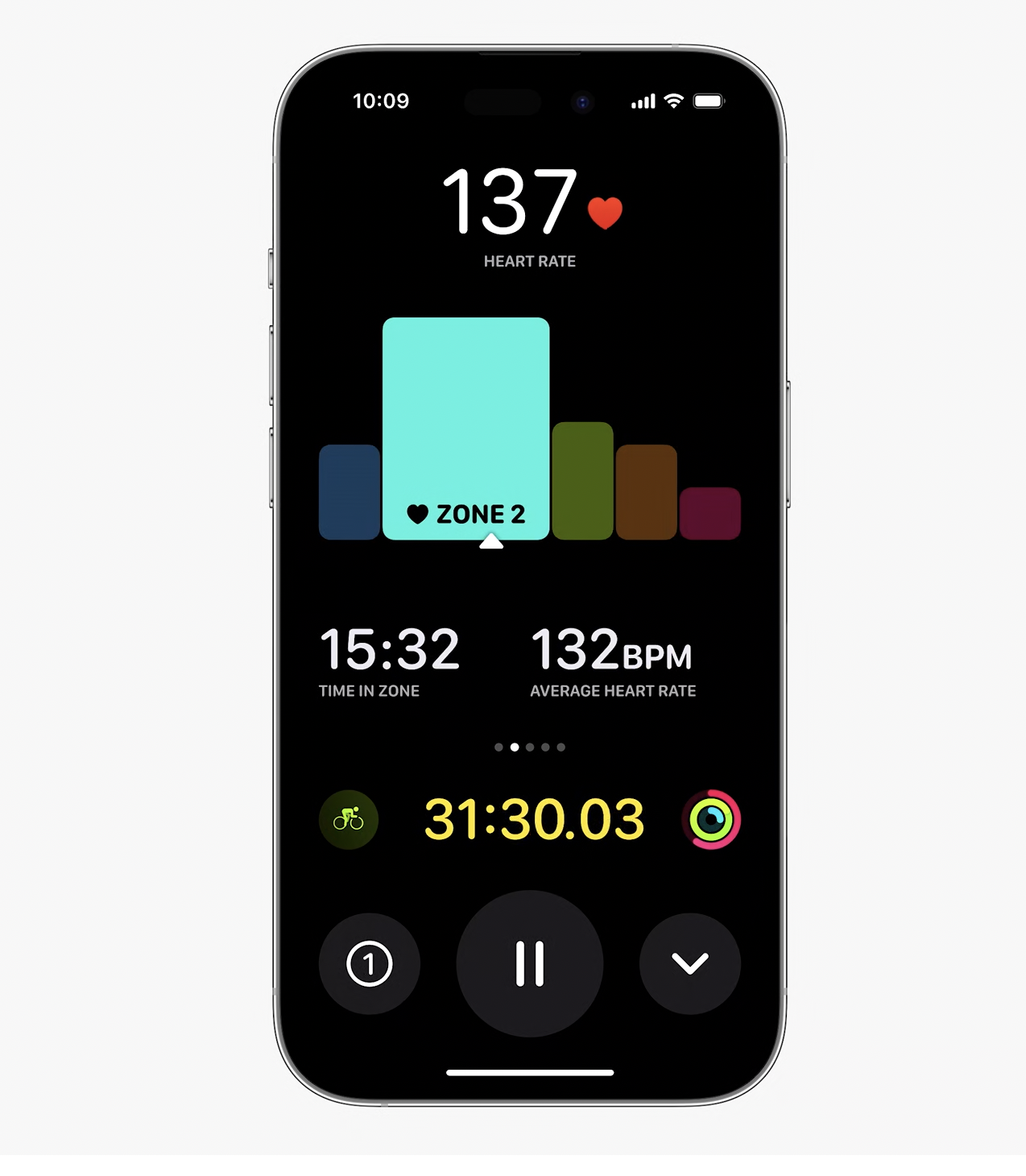
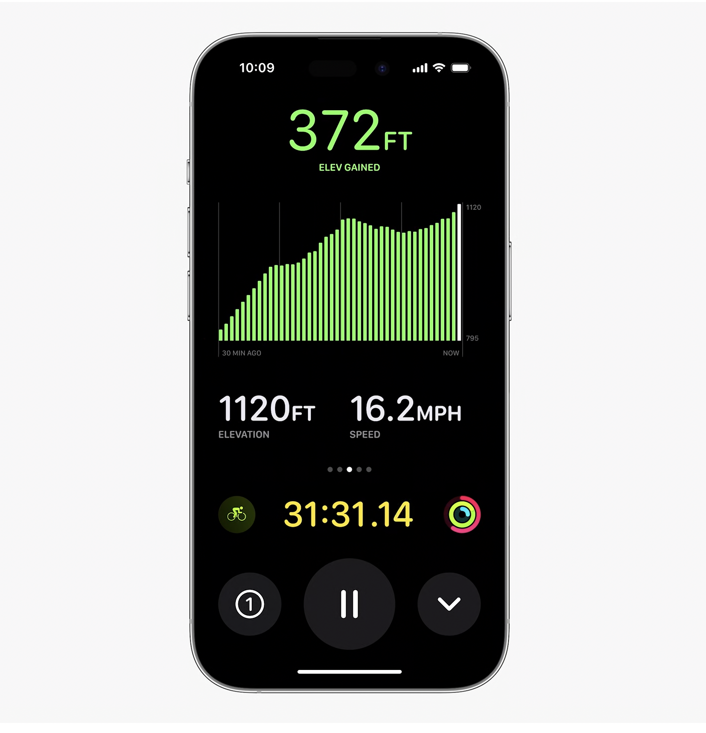
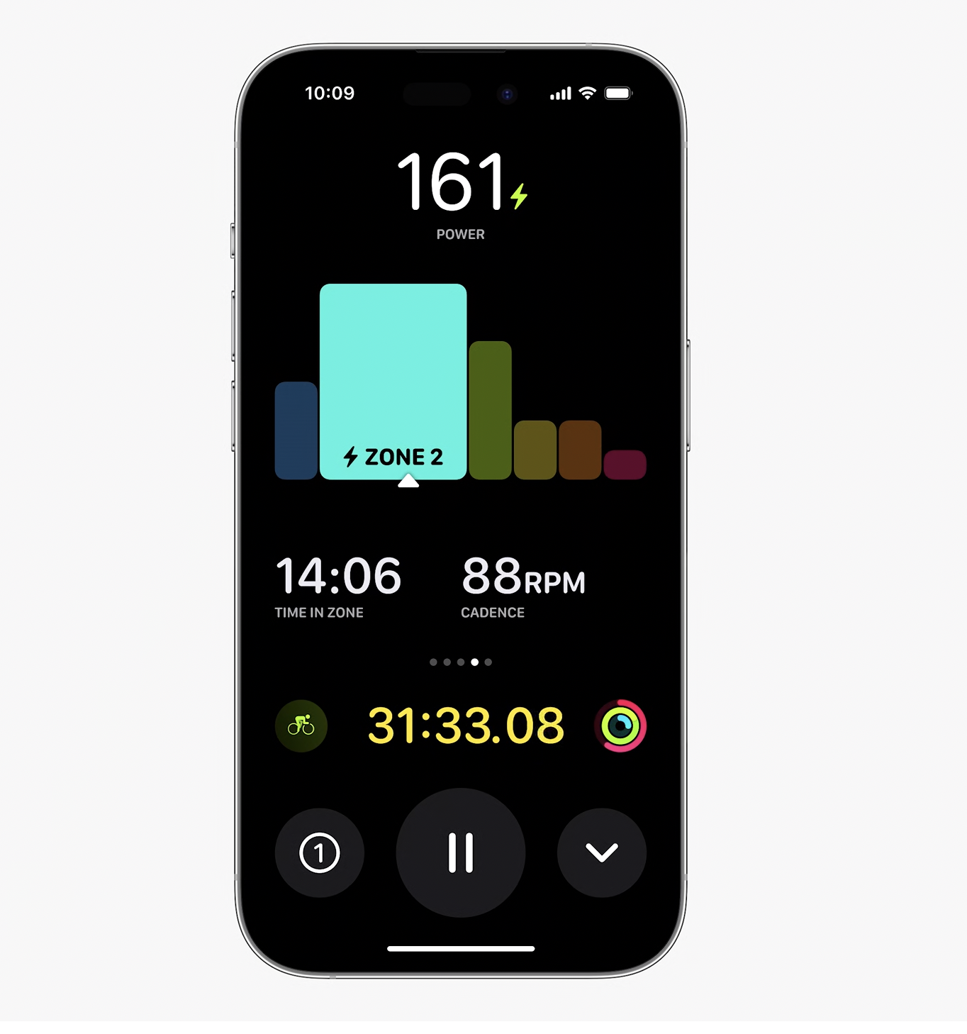
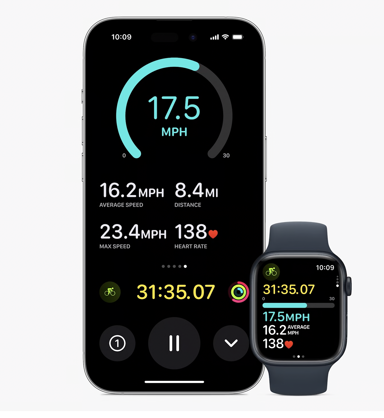
It's going to be a very interesting few months in the cycling computer manufacturers world. As somebody mentioned above about Apple's announcements of the next watchOS. I went and had a look at the keynote.
As of July (when I can get the betas for Apple Watch Ultra and my iPhone 13) I'll be able to connect all my sensors (speed/cadence/power) to my watch, ditch my HR chest strap and have all the data I want displayed on my quad locked iPhone in a 'live activity'. I'll have FTP calculations done by the Apple workouts app, see my power zones for power zone training and all in a clear, readable UI.
DCRainmaker has an excellent summary video (as well as one on this new HH UI) that show how it will all look.
I know and understand it won't be for everyone due to device preferences etc but I can at least see an alternative option in the very near future to my own K2 unit.
One upside is it will probably stop people requesting HH, Wahoo, Garmin etc to add HR support for Apple Watches as they will get it all with their watch/phone in a few months time. I then imagine we are only a few dev cycles away from Apple Watches and phones displaying live train maps etc for routing. In fact I would think that Komoot and Strava are licking their chops at what this announcement means for use of their apps on iPhones attached to bikes.
Some shots for any interested parties/UI designers: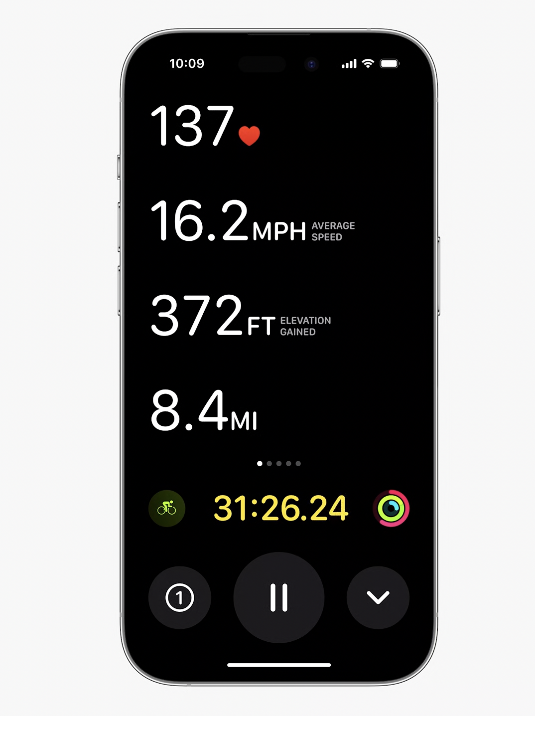
-

Hi All,
We appreciate the time you all have devoted to provide us the continuous feedback on the new update. Although, from the support team we cannot provide any immediate solution to end users, I assure you that all the feedback has been shared with the Product team. Once I have more update from the Product on the next steps, I will be happy to share them with you all.
Note: Please expect slower turn around times as we are overwhelmed with incoming inquiries relating to currently ongoing Karoo 2 sales and trade-in requests.
Thank you.
-

@Jim C
I appreciate your comment about the Support team being a mediator, but the underlying issues are still with us. Ali has just told us that the Product Team don't have a solution. Now, that may be because they really don't have a solution at present (which is worrying) and are working on something. Or, that they aren't going to bother with a solution at all (even more worrying!).
I understand that the Product Team don't have to communicate directly with their customers, everyone has their own jobs in a company, but the Support Team, (which just seems to be Ali these days) can't tell us anything and that is what is frustrating most people.
Through all this debacle, there has been one part of the Hammerhead company that no-one has mentioned. The company owners/SRAM. They say that good leadership starts from the top down, but not one single word from 'the bosses'. Maybe a small statement from the people at the top to show that they are aware of the upset that has been caused.
-

Saw this updated UI on my wife's Karoo and now I'm very happy I didn't execute that update. Especially in dark mode, the boxes are ugly, the numbers are too small and the text way too big. The important information is not the static one, but the sensor data!
Before, it was really good, useful and beautiful, I won't update until this mess vanished. -
The bottom line is I don’t believe HH is going to deviate from their plans and all our complaining and temper tantrums isn’t going to faze them into shifting their direction. They’re solely in this to make money and as long as people continue to buy the product nothing else is going to matter to them. In the grand scheme of things 187 negative comments is a shrug of the shoulders for HH.
I accept responsibility for my share of comments however have now concluded I can continue using HH or move on to another device. Either way HH isn’t going to care what I decide. 🤷
-
@Lee A Dorney,
I’ve used all the head units and am familiar with them all. I own the 1040, the Wahoo Bolt V2, the Roam V2 and the Karoo 2.
Out of all of them in terms of screen visibility outdoors the Wahoo units beats them all. The Hammerhead, despite the once beautiful screen has consistently been dreary outdoors - especially in sunlight. While amazing indoors not so much outdoors.
In any event my main point at this time is 7-pages of comments doesn’t obligate HH to do anything. I wouldn’t hang on to expectations on this front. HH has a plan for the direction they want to head and I have significant doubts they’re going to deviate course on our behalf. For everyone of us that has had a temper tantrum (me included) there is someone else to step in and support their vision. We are simply not enough to move the scale imho.
Good luck -
-

Regardless of our reasons and opinions on the matter, the fact is the changes go against basic UX principles. What they used to have aligned with what many design systems use (example: https://ant.design/components/statistic). This is very different than if we simply didn’t like the new design…that’s opinion and the company can do as it pleases. But going against basic UX and design principles is crazy.
-

@Stephen Black, No one is trying to divert Hammerhead its own way. If they think the best way is a tiled UI and they have a plan with it we have to accept it. BUT, it could be done with a good looking and a functionally correct design. And I hope this 7 page dissatisfied comments enough to correct they design mistakes.
And another BUT, I think we all have to agree that Apple and other big (huge) leader companies have the best designers, they have extensive market research, they have the far most user feedback, and they can win or loose huge amount with a bad or good decision. Now look at the Apple or Google style UIs. It clearly shows that Hammerhead is moving to a wrong direction with the UI.
A marketing research is an expensive process. Designing a good, widely acceptable new UI concept is a very risky and time consuming and expensive process. I think it is not necessary to done by Hammerhead. Many good looking and working UIs out there which designed by huge companies. Hammerhead should just look at these already made UIs, and has to "copy" (gets an idea from) these. This 7 pages user feedback is a free research for Hammerhead. They should evaluates our feedback and they should use this data.
-

even if Hammerhead has "plans for the future" that may justify the move, they can't release something halfway, break current, not give the option to revert the change... It's like Microsoft failing with a Windows update (which happens) and it did not give you the option to uninstall it, and the days go by and they do not make a statement when they are going to solve it. It seems to me a great lack of respect for your customers. For me it is the most critical current bug that the device has. A broken interface
-

Totally agree. I strongly dislike the new UI layout, and while I understand that it represents a potential step towards future improvements, it is completely unacceptable to release a firmware update with the current UI layout. As a devoted Karoo fan and one of the early adopters, I find this to be a significant issue that has made me contemplate switching back to Wahoo.
-

Couple of rides in with my borrowed 1040 - centred labels, clear layout, excellent visibility in bright sun, fast startup and sensor connections, insane battery life, Di2 integration built-in. I have to say it's a very nice unit (as it should be for the money).
The Karoo2 isn't going back on in its current state.
-

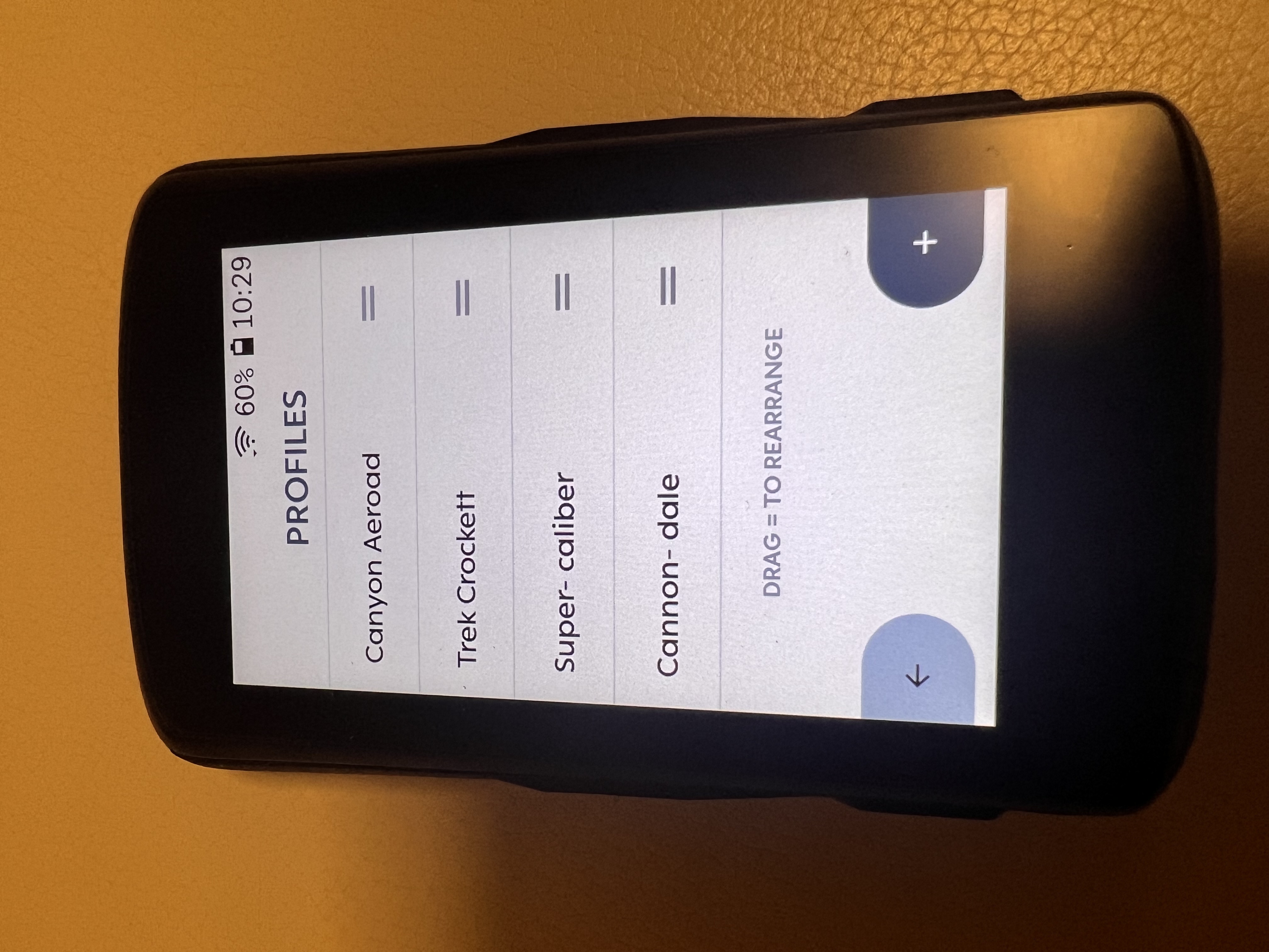
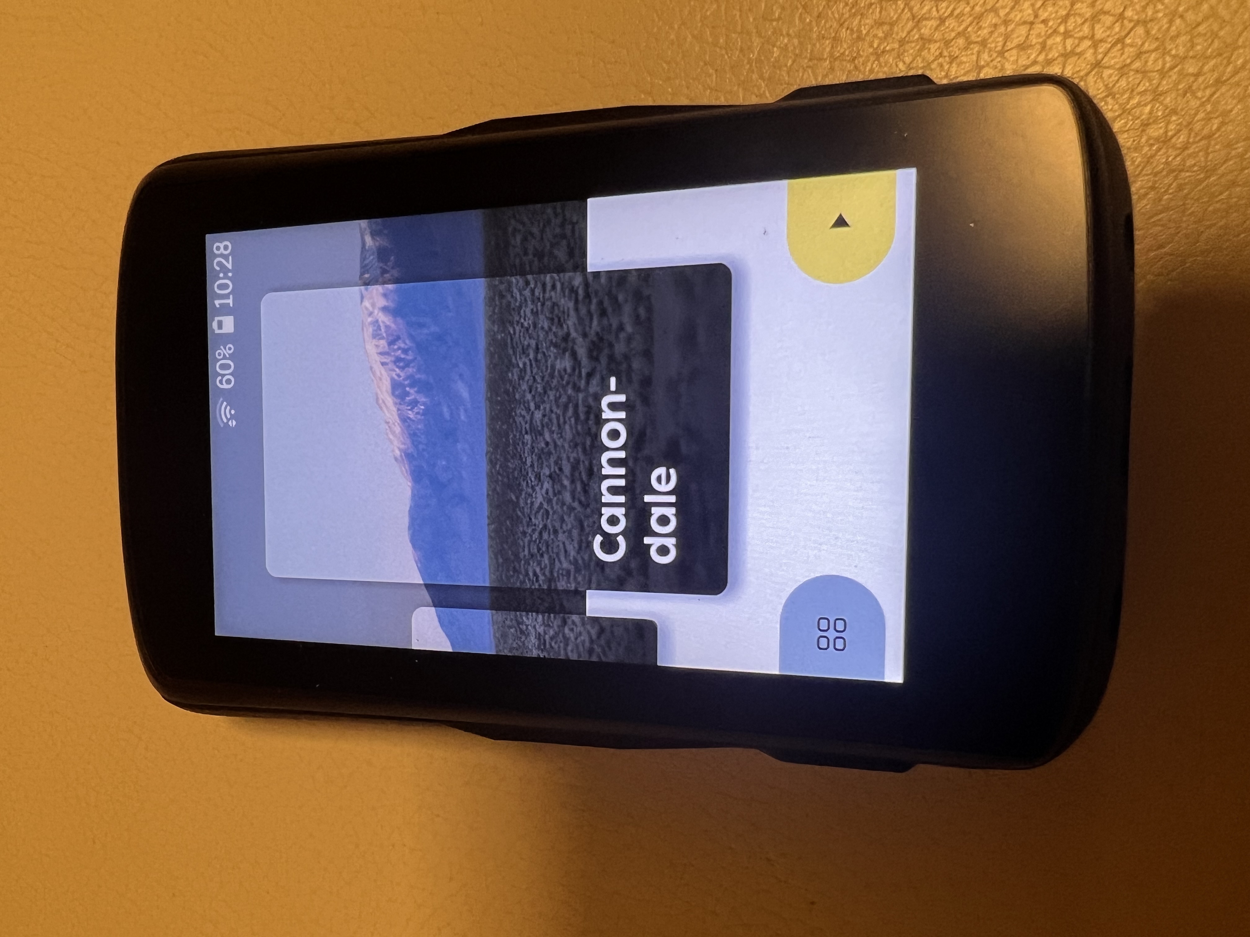
@Anna Ronkainen thanks for the Tipp, I’ll give it a try. I actually see the profile names before every ride when I do the profile selection.
Edit: I now now what you mean - it does look weird when you are in the profile settings page. :) Just tried it, doesn’t really make things better. I’d still prefer it if the names were scaled properly like they were before, rather than being hyphenated.


Please sign in to leave a comment.
Comments
314 comments