Do you like the new "in-ride look"?
I always try to be positive about new user interfaces. I always try to recognize the advantages of new UIs. In my previous job I designed a lot of UIs.
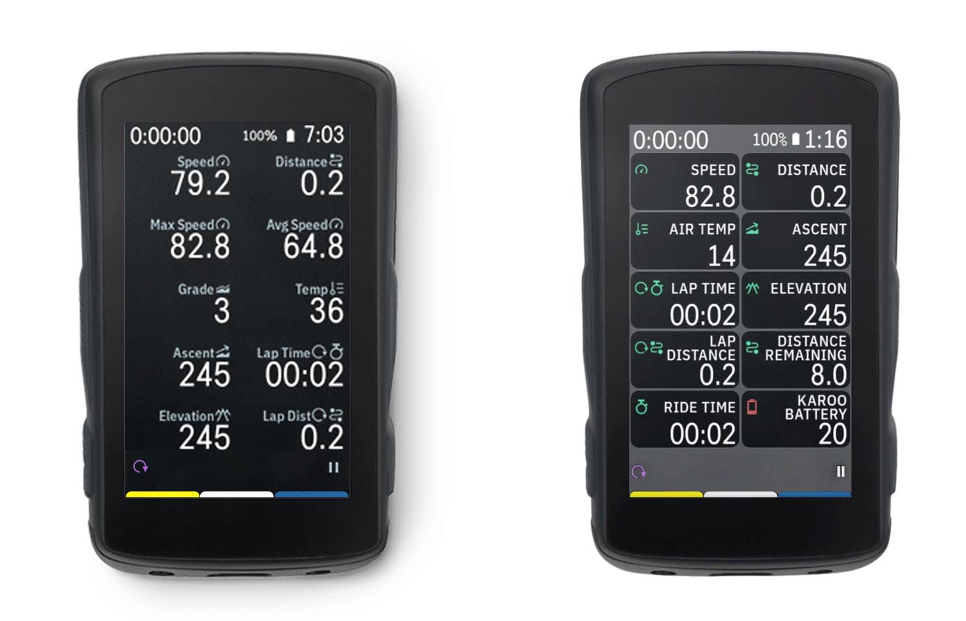
But this new updated UI does not work for me. The legacy UI was a very good looking UI (It had some roughness, but was a nice, modern UI). The new rounded corner boxes are pointless, the grey background color is ugly, and not harmonic. The legacy UI was much more modern this new UI is just old fashioned and outdated. The large upcoming elevation graph black background on a black screen looked very good, the new grey graph is just ugly. The legacy UI gave higher contrast feeling, the new grey color brings low contrast feeling.
My suggestions for Hammerhead are rethink and tweak this new UI and/or make an option to use the legacy UI (my main buying decision to Karoo was the good looking UI). The best would be it you keep the style of the legacy UI and make small updates and error corrections on it. It the new boxes layout is a must have (for future functions), you have a much more better way to design a boxed layout.
Please review this new UI!
What do you think?
-

Don't really like the new look, I hope they will tweak it towards something better. I also didn't like some other choices they made during development (like the command center, vs android toggles for instance), but most of the time they iterated towards something better in the end.
I wonder what they will do with all their marketing still showing the old look...that will surely confuse new customers?
-

I just watched "the Nero Show" on Youtube, which is kind of a Cycling podcast and Chris Miller was raving about how he likes the new look as it looks closer to what Garmin does now.
I was puzzled, I liked the K2 interface exactly because it did not look as outdated as the alternatives.
-

I agree that most of the Karoos UI (pre update) was visually appealing.
But even before this new Update the UI was never very glanceable.
- Data fonts were thin and small with lots of unused space
- The control center is grey on grey with tiny fonts and icons (I always confuse battery save with sounds and then suddenly the screen is off instead of having sound).
- The icons in the in-ride screen are so small they could just as well be dots or left out entirely.
- The icons in the app drawer are the same, they are so small that they are entirely pointless.The new UI does not improve on the above, but makes it even worse by making the data smaller. In addition, in contrast to previous UI changes it is not visually appealing at all:
- The size of the gaps between boxes change depending on wether you have a route loaded or not. This looks absolutely hideous.
- 3/4 of the boxes is whitespace, which is neither good use of space, nor visually balanced. Everything is just concentrated on the right.
- Floating boxes on the middle of the map when there are button icons or arrows present. Who the hell thought “Oh hell that looks great!”? No one.
- Massive discrepancies between data fonts due to two line titles in narrow boxes
- Two line titles. I hope this is just a bug, no one in their right mind would think this is a good idea?! Right?
- This might be personal, but why exactly are the icons green? Color coded data fields are not possible, but green icons! Thats the most efficient use of our “best in class screen!” Yeah surely…As a summary, I really do not mind a boxed layout, even round boxes would be fine. But it is completely unacceptable to ship such a half baked clearly untested and not well thought out solution. UI changes are one of the most important things to get right and what Hammerhead has done here clearly is the complete opposite.
This is something that should result in a public response by a Hammerhead spokesperson where they line out what changes they are making to the company to ensure something like this does not happen again.
-

I make my first ride with the New UI. Not bad at all, but it needs some big change. Please this is not a Garmin GPS, Please don't copy the bad UI garmins.
There are icons that is located Just up of information when we have 8 or 10 display info. The climber trigers it was change the information, it was a great one in wite letering and a blue, now a horrible one boxes. I know tha in the future is to we can change de information tha we have o. The climber triger but pelase the actual design needs be back to old one and a clean beatifulf one.
-

I received my Karoo 2 yesterday, spend ages looking for a way to get the in-ride screens like what I saw and thought I was purchasing, only to find out it was changed and now looks utterly terrible, I feel completely betrayed and ripped off, none of the marketing images show this (obviously would take for ever to update them all), but one of the main reasons I bought it was the UI, now it looks worse than my old 520 and Bolt -_-.
-

@Curtis Hard
My condolences.
I know how you feel. It is so frustrating and you can do nothing. I got my K2 some months ago and I have been totally in love with it till the last update.
Had a 12,5 miles climb last weekend: my eyes were more painful than my legs. The new UI is a total disaster. Sorry Hammerhead but that's the truth.
Plus, the K2 had another issue giving totally wrong timing (=longer) on some Strava segments. :(
-

Welp, we are on day 12 since the UI debacle arrived .. Thankfully I never did the upgrade as I happened to see one of the 1st negative comments about the UI changes .. So as I see it HH can and should roll back to the last version (the one with the good UI) for everyone .. Then, continue to fix the bugs we have reported and add new features from the ever growing list of requests .. PSA, none of us ever asked for this “UI bug fix” or this “UI feature enhancement” nope, not one of us.
A loyal (for now) supporter and active cyclist who truly enjoys this awesome K2, you know, the K2’s running the last software version
Karoo Software Build Version 1.386.1509
-

It sounds like I'm in the minority here in thinking this is likely (hopefully) just a stepping stone to what I imagine will be a larger improvement:
So I agree it looks worse, but with some dev background I think this is what they’re gonna end up going for: being able to drag and drop these data fields and move them around in ride, enable things like tap to change the field, reposition it, remove it, etc. all in ride without going into the profiles menu.
I agree it’s ugly now, but I think they can refine it and achieve some/all of what I mentioned, then the awkward space is somewhat justified in the short term. If I’m completely off base, then yeah, it makes no sense. The two week release cycle seems to be nice in the long run (whereas with say a garmin, they may introduce a change that is problematic and sticks for months), and I wouldn’t be surprised to see it massively improved upon.
Also, being able to sync rides from the device itself with a SIM card is actually the biggest feature improvement in a while. So I’ll deal with the ui downgrade for a bit since I think it will turn into an upgrade and the in ride sync is great. Just my two cents.
Maybe @Kristóf Szabó can comment on whether or not I'm completely off base here, but I'm going to give them the benefit of the doubt as in the long haul (and relatively speaking, compared to say garmin, their release cycle is super fast) the improvements have been exclusively positive in my experience.
-

@Zachary Harner, I also think that Hammerhead did this change with purpose. I also think the goal was to create objects which are movable (in the future). But I do not think these objects need this harsh visual highlighting to show that "hey, look, we are movable objects". If Hammerhead would like to introduce a function which can move the data fields freely, they can keep the legacy UI, and highlight the fields in case of moving. Ex. if you long press any data field, all the fields get a border which shows the fact that they are movable now. After you are done, the borders disappear. This is just one example how could it be done better. There are a lot of good example out there on the market from huge successful companies. If for some reason Hammerhead insist to the always highlighted fields (borders), they have a lot of better way to design a boxed UI.
It is a huge mistake, it should not have happened.
I hope, and I'm sure they will tweak it (I hope they fully redesign it).
-

But from a software dev standpoint one would not release a beta state to the public / productive environment to improve it then again. For me, these boxes can be moved around also with the previous visualization. No need to make ugly round boxes with a solid thin stroke. This is so before 2007 haha
-

Wow … Been a good few days not looking at this. And it’s up to 8-pages. It seems to me this last update is a half baked one that wasn’t ready for prime time nor given much care or thought. I’ve put the Hammerhead aside for the time being and will decide with each subsequent update of the new UI whether Hammerhead is the company I want on my computer mount. In the meantime, rode with the Wahoo ELEMNT Roam 2 this weekend. Better battery - Much Crisper and Visible Screen - and overall a much better and simpler stress free experience. Wahoo’s Free Ride Summit Feature is also better imho.
-

I would add, they if legibility is the goal, then you shouldn’t be moving data fields around once set. Unless you really need to make a change.
The key to in-ride legibility is being able to glance down and know exactly where each data field is. Eg speed is top left, kms top right, average speed bottom right corner etc.
This comes from riding with the same screens and data fields over time. The idea that you would chop and change these fields regularly would only lead to confusion in ride.
-

I agree with @Pit on the issues with the pre-update UI, and the list of ways the new UI is worse. The mock-up that @Kristóf posted on page 3 would be a huge improvement.
Having used the new UI on a few rides now, it really is less legible and more cluttered — certainly not "easier to see and understand" as the 1.389.1526 Release Notes claim, and just about the opposite of "Data Made Beautiful" as the current marketing material says.
I mean... just look at this:
(Edited to update comparison image to include In-Ride Drawer tabs and Lap and Pause buttons for both)
-
@Guy C - good point! I really do like the way Wahoo handles changes to the fields via the zoom in/out button to reduce the fields and focus on more relevant ones. But really changing the layout mid ride might be interesting for the first rides when you are trying out what layout works best for you. But I think this is done then after 2-3 rides...
@Stephen Black that's what I keep feeling at the moment. I do not ride every day due to my job. Sometimes only every 2 weeks. But everytime I turn on the K2 I hope that nothing is broken what worked well 2 weeks ago! It really feels very unstable. One day it is the UI, the next day it was that route is being stuck in "preparation mode" when loading up the navigation... Always something new. And my friends with the Wahoo just smile at me ;-)
-

I would be surprised, if they would change anything big with in ride look in this release. They just haven't got enough time for that. Only if they would rollback this and work on that to later releases, but I don't except that. But if they don't make any change in that next release 2 weeks later, well, that would not be a good sign.
-

Due to the current UI clusterf*#k, I have now purchased a Wahoo Roam to enhance my rides... As for the future developments with HH, I will keep a close eye on the direction they take. However, if I continue to feel that the firmware updates are not improving the device's performance, I may consider alternative options such as selling or repurposing it for other uses. My priority is to have a functional and efficient (and preferably a good looking) cycling computer....
-
Another day on the road, another day of frustration whenever I look at what was good and now it's terrible. I'm talking about like thousands of Hammerhead KAROO2 users, yes I wrote in Caps Look because the variables that we have in the information UI now appear. Something is very wrong when experiments are carried out without at least consulting users about how the evolution of a cycling tool such as a GPS can advance. As much marketing as Hammerhead does, I believe consumers will question whether anything from this brand is worth buying. No brand has grown as much as Hammerhead, largely due to its great ability to associate all advertising marketing to Karoo2, most of the time in an erroneous way. The fact that we were bombarded with the idea that updates and new options would be systematically released every 15 days made the community believe that this would be the case. It wasn't, it isn't and it won't be, because we know very well what was the idea of \u200b\u200bthe launch of the Karoo1 and its evolution into the Karoo2. Continuously since its launch, we continue to be clarified that there are requests that are in the team to assess whether or not they can be launched {Drink, Eat Alerts} which makes one think that the requests were being forgotten or even thrown into the trash. I got my Karoo2 about 2 years ago, for 8 years I tested hundreds of beta tests with Garmin. For cycling GPS. These days I have no idea how the Garmin beta test program is doing, but I believe that wisely they will already be running in the evolution of the 1040 (or the 1050), as happened with the entire high end of Garmin where nothing is left at random, or so it was. I left Garmin because I believe that the world of cycling has room in this segment to grow and a lot, there is currently almost no GPS brand that is below what Hammerhead has, it is true that the innovation of predicting climbs is its characteristics (Climber) was indeed something innovative, but Hammerhead only went ahead with the launch of something that already existed programmed at Garmin and which was never released due to the fact that the wrong data was too obvious, opting to keep updating maps and curves of worldwide level. Even so, the error will always exist. This week I received the Rox 12.1 EVO at home on loan from Sigma and I can say that it is very well done and that according to a friend of mine running for about a month with this GPS, he only says wonders. Here at home there has always been Garmins, of course, but other brands have appeared, such as Wahoo since the first mini, element and element Bolt, largely because of cyclist friends who always tried to change my mind. When the Karoo1 was launched, I didn't buy it, but some friends of mine from Electric MTB still use it because of my influence, never regretting it. However what I can say at this point is that I used my Karoo2 for the last time, and what would make me most happy was that the marketing campaign of if you are not happy in 45 days money back, you can be if you are not happy for the commercial life of the product you purchased we refund the value of the same referring to the date of the last commercialization and value, this should be the phrase that makes more sense at this moment, because who is not interested in their customers, their opinions and does not present solutions to the requests for improvement that customers bring for free and that they just discard for maybe one day, the idea was passed on to the team. There is no resolution date. Finally, a brand with this kind of attitude, idealism, can never evolve or win in this market. I remember that even Nokia was reduced to the little that it never imagined could happen and here it will be the same. For now I'm going to leave aside the Karoo2 and use the Sigma Rox 12.1 EVO who knows if I'll use a Karoo again or if even the brand will stand the test of time.


Please sign in to leave a comment.
Comments
314 comments