Do you like the new "in-ride look"?
I always try to be positive about new user interfaces. I always try to recognize the advantages of new UIs. In my previous job I designed a lot of UIs.
But this new updated UI does not work for me. The legacy UI was a very good looking UI (It had some roughness, but was a nice, modern UI). The new rounded corner boxes are pointless, the grey background color is ugly, and not harmonic. The legacy UI was much more modern this new UI is just old fashioned and outdated. The large upcoming elevation graph black background on a black screen looked very good, the new grey graph is just ugly. The legacy UI gave higher contrast feeling, the new grey color brings low contrast feeling.
My suggestions for Hammerhead are rethink and tweak this new UI and/or make an option to use the legacy UI (my main buying decision to Karoo was the good looking UI). The best would be it you keep the style of the legacy UI and make small updates and error corrections on it. It the new boxes layout is a must have (for future functions), you have a much more better way to design a boxed layout.
Please review this new UI!
What do you think?
-

That's a half measure. I can't get it all the way back to what it was prior to the last release, which is superior to what was offered today.
But if you want it configurable, here's what you need to do additionally:
Option for shorter field names limited to one line.
Option for no labels and icons only.
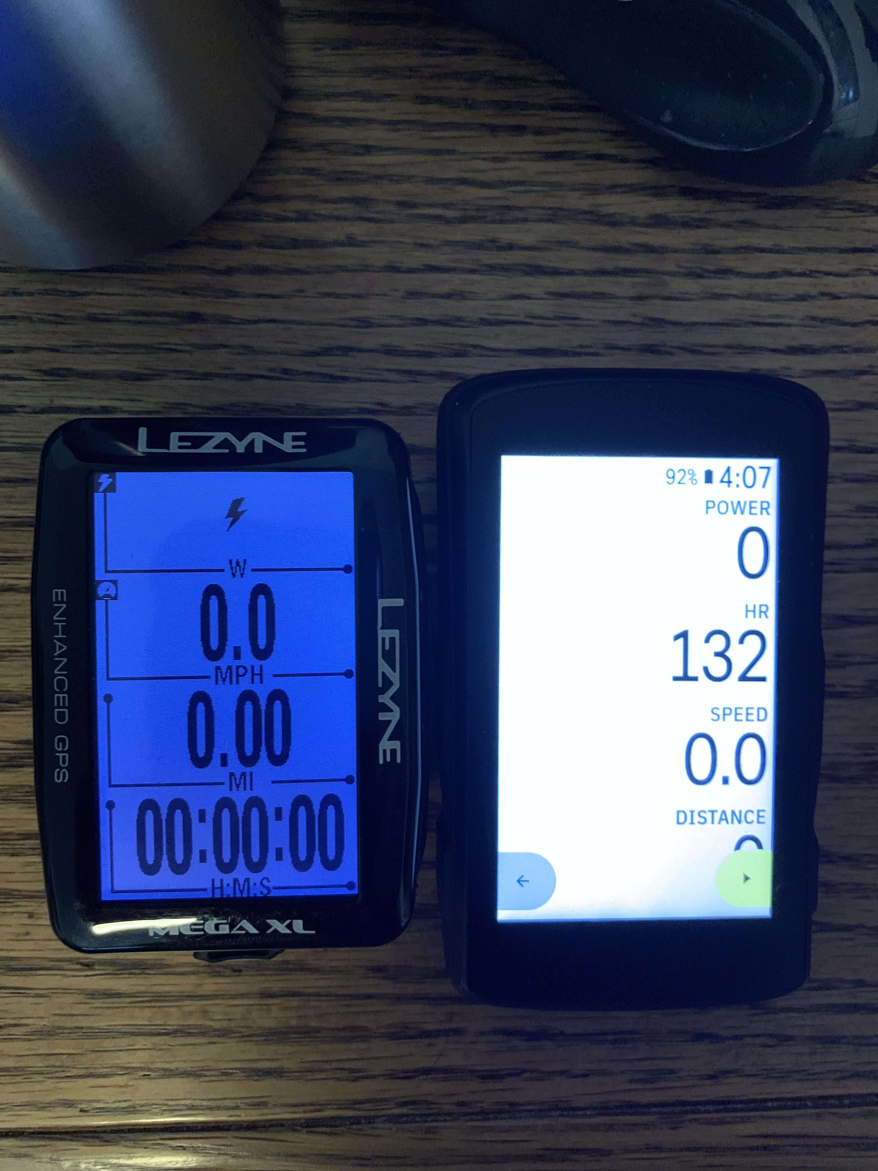
KJOULES is not superior to KJ. POWER is not superior to PWR. If you need two lines for a field label then you are labeling wrong. Give me BIGGER NUMBERS that I can SEE BETTER. This is an accessibility issue as my near field vision is pretty typical for a 60 year old, and the big reason why I bought this device is the BIGGER NUMBERS on a BIGGER SCREEN.
Bike computers are for showing data, so maximize the data in the data fields.
-

Really not wanting to start a rant here, but seriously...
"I don't really care for calling them a jerk as that's what Americans seem to use as an adjective for a stupid person/s". As one of those American jerks, thanks 😉We buy products knowing that a manufacturer may change, improve, discontinue, etc. Would you flame and return a car you bought with, lets say, android auto if Android updated the UI in a way you didn't like?
-

If you bought a product, obviously, any idiot can ruin it, but not a seller. It has been paid for the product and it bears responsibility not to break it with its own wish. For example, someone bought a HH. He (or she) desired to buy the device as per photos on the site, videos, docs, etc. But the device has been updated right after unpacking. Can we say that the vendor stole the original device and replaced it with a ruined one?
As you can see, the device is being advertised with the old screenshots. -
No not entirely. You can’t go back to the previous design. They still stupidly devote two lines to the field label and use whole words instead of abbreviations. This means the data -what you are actually interested in seeing - has to be smaller. They also don’t scale the labels so the effect is even worse on pages with 8 or 10 fields.


Please sign in to leave a comment.
Comments
314 comments