Cursor/Position triangle in middle of the screen not bottom K3

Hello,
After the latest firmware update (1.588.2263), the cursor/triangle showing my position appears in the middle of the screen instead of at the bottom, making map navigation essentially unusable.
I discovered a temporary fix by creating map data fields in two rows on top, adding them, then removing them. This moves the cursor back to the bottom. However, the cursor jumps back to the middle whenever I select any navigation point.
Looks like error with some invisible data fields on bottom of screen pushing cursor to the middle.
I cannot understand the idea of putting the cursor in the middle of the screen, especially because the Karoo 3 doesn't use a compass to orient itself correctly when not moving.
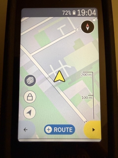
How it should be:
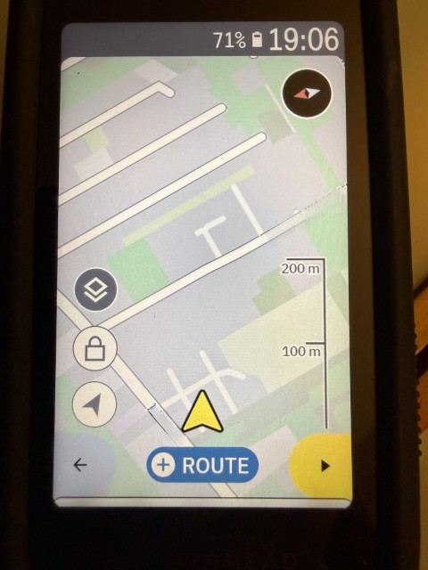
And wrong one:
-

The position of the arrow is a bit erratic and inconsistent. However, I do **not** agree that having it in the middle is making navigation useless. It actually depends on the expectation (very personal) and mode of navigation display.
- If you're navigating with the map showing the direction of travel upwards, having the arrow at the bottom (or close to it) will work in many cases. However, there are cases (sharp bends, going up/down alpine slopes), when this display is very inappropriate (i.e, you essentially see nothing of the route ahead, if the bend is close 180°).
- If you are navigating north-up (yes, this is my preference), then having the arrow at the bottom is essentially defeating usability.
- When a draw pops up, having the arrow at the bottom also does not work (because the drawer covers the arrow). I'd say this also messes up navigation completely, unless the arrow is. moved up in this case (which it currently is).
I suggest that this feature is reworked, but it should be done depending on context. I'm fine if - in your use-case - the arrow is closer to the bottom (but it should not be at the very bottom, because of sharp turns, and it should be moved up. when the navi drawer pops up). I would like to have the arrow in the center, when navigating north-up. Moreover, data fields should be considered for positioning (the arrow should be places close to bottom or in the center of the actual map view).
-
Well, the position in the preview is "difficult", because the actual position of the cursor *should* depend on context / use case, as I stated above.
I understand that for direction-of-travel-up navigation, it makes sense to have the arrow towards the bottom (but as I stated above, at the very bottom is not ideal in case of 90° and above corners). For some other cases (north-up map display or routing, turn drawer half way up, data fields on top or bottom), the position of the cursor should be different. This info is not available for the preview, this is actually not an issue.
-

Guys, there's a lot of theoretical considerations here. It's been a good solution for six years, and I don't understand why it was changed for the worse. The cursor in the center, in my case, when navigating in the direction of travel, which I always use, is a bad solution. Yes, the Climber's drawer covered the cursor, but generally, it's not a problem for me. If you're driving on flat terrain, the Climber doesn't show up anyway. If you're having trouble with the Climber and the covered cursor, close the Climber—one finger swipe is easy. I want the cursor to return to the bottom or the ability to change this setting myself. I bought a device like this five years ago, and now it's not the same in navigation.
-
Hey Grzegorz, it is **not** about the Climber drawer, it is about the Navigation drawer. It is a bad solution, if the navigation drawer covers the cursor (which is used for ... navigation). Apart from this, I agree that having the cursor in the center when the map is oriented in the direction of travel is not ideal. However, it is also poor to have it at the very bottom, and that's probably why other devices don't have this (just checked Google navigation). In the end, it's a design choice, with which you can agree or not.

Please sign in to leave a comment.
Comments
7 comments